Ever downloaded a document or received a file from a friend only to have it print out badly? There are lots of potential causes of such problems: different typefaces available to the creator and the printer; different operating systems and different versions of the same operating systems exposing limitations in supposedly cross-platform standards; different printer engines, especially when crossing between ink-jet and laser; and so on.
An oft-overlooked cause of problems, however, is different paper sizes. When people in the US and Canada reach for a sheet of paper to write or print on, chances are they reach for a piece of Letter-sized paper (also known as US Letter), measuring 8.5˝ by 11˝. With few exceptions, when people everywhere else reach for a sheet of paper to write or print on, they reach for a piece of A4-sized paper, measuring 210mm by 297mm.
A quick conversion between inches and millimetres shows the two sizes aren't all that different:
| Millimetres | Inches | ||||
| Width | Length | Width | Length | ||
| A4 | 210.0 | 297.0 | 8.26 | 11.69 | |
| Letter | 215.9 | 279.4 | 8.50 | 11.00 | |
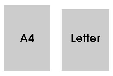
And a scale representation of each page size reinforces the closeness of the two paper sizes.
Which raises the question, why the difference at all? If both sizes are arbitrary, why bother with maintaining a difference. The answers are long and involved, and mostly outside the scope of this article. At the core, however, it comes down to one thing: A4 isn't an arbitrary size.
A4 Described
A4 is part of the ISO 216-series of related paper sizes known more commonly as the A-series. This series starts with the large A0 sheet and a quick look at this large sheet of paper shows why these various sheets are the sizes they are.
A0 sheets of paper are 841mm by 1189mm. Again, apparently arbitrary. Multiply the two numbers together, however, and it becomes a little clearer: 841 * 1189 = 999,949mm squared or 0.999949m squared (ie just a smidgen under a square metre of paper). For all practical purposes, an A0 sheet contains a square metre of paper.
So why not make it a 1m by 1m sheet? Because of another non-arbitrary consideration: the aspect ratio or relationship between the height and width of each sheet.
1189/841 = 1.413793103448276. Not particularly memorable, unless you happen to be maths-geeky enough to see the similarity between it and √2 (the square-root of 2, an irrational number which starts thus: 1.414213562373095). Round both numbers to four significant figures and you get the same value: 1.414.
So, the aspect ratio of an A0 sheet of paper is, again for practical purposes, one as to the square-root of two or 1:√2. And again, I hear the cries: ‘so what!'
A ratio of 1:√2 is more than a mathematical oddity. It doesn't have a nifty name, like the famous Golden Ratio or Golden Mean. It does, however, have a nifty property. Divide a rectangle with sides 1:√2 along the longest side and the smaller rectangle you create has the same aspect ratio. (Markus Kuhn suggested in correspondence we call the ratio the Lichtenberg Ratio, after Professor Georg Christoph Lichtenberg, the German enlightenment figure who first proposed the ratio as a basis for paper formats in 1786.)
Getting back to the ratio (named or not) and its nifty property: if we start with a honking great sheet of A0 paper:

We can easily, and quickly, derive all the other A-series sizes by folding or dividing thus:
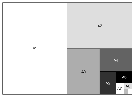
In less visual terms, any sheet of A-series paper is as long as the next-larger sheet is wide and half as wide as the next-larger sheet is long. To wit:
| Sheet name | Width (mm) | Length (mm) | ||
| A0 | 841 | 1189 | ||
| A1 | 594 | 841 | ||
| A2 | 420 | 594 | ||
| A3 | 297 | 420 | ||
| A4 | 210 | 297 | ||
| A5 | 148 | 210 | ||
| A6 | 105 | 148 | ||
| A7 | 74 | 105 | ||
| A8 | 52 | 75 | ||
There are other benefits to this relationship between paper sizes, not least of which is when you want to scale a particular layout. If you've ever wondered why photocopiers offer a 71% reduction option wonder no more: 0.71 is approximately equal to (√2)/2 or √0.5. This makes it perfect for reducing an A3-layout onto an A4 sheet, or an A4 layout onto an A5 sheet or, more commonly, reducing two A4-sheets side-by-side -- say in a journal -- neatly and without fuss onto one A4-sheet. The equally common 141% option is, of course, perfect for enlarging from one A-series sheet up to the next (eg A4 to A3). Most important, because each sheet has the same aspect ratio, objects retain their relative shapes: squares don't become rectangles and circles don't become ellipses.
If nothing else, this constancy of relationship makes A-series paper simpler to work with than older paper sizes such as Brief (13˝ by 16˝, and the source of the 'briefs' lawyers still use) or Foolscap (27˝ x 17˝) and its near-letter sized derivative, Foolscap Quarto (13.5˝ by 8.5˝, commonly if erroneously called 'Foolscap').
Add in a clear connection to the metric (or, more properly, the SI) measuring system and the rise in popularity of A-series paper is fairly easy to understand: as the world has slowly but surely gone metric, so A-series paper has become more popular. In Australia, for example, the metric system was adopted officially in 1974, the same year A-series paper (and related series such as the C-series for envelopes) started to become the standard.
US Letter Described
The clear connection to the metric system is also a partial explanation for the continued use of Letter-sized paper in the US and Canada. The US is almost the only country left not to have made the switch from non-metric measures, making the particular advantages of A4 less evident. As well, although US paper sizes are as arbitrary as is sometimes contended, they aren't impossible to work with.
There is no derived starting point (equivalent to the 1 square metre for A0) for US paper sizes but the two most popular sizes -- Letter and Tabloid -- are part of an old American National Standard Institute standard for technical drawing paper. This standard (ANSI/ASME Y14.1) had five paper sizes swinging back-and-forth between two different aspect ratios:
| Sheet name | Width (˝) | Length (˝) | Aspect Ratio | |
| A (Letter) | 8.5 | 11.0 | 1.294 | |
| B (Tabloid) | 11.0 | 17.0 | 1.545 | |
| C | 17.0 | 22.0 | 1.294 | |
| D | 22.0 | 34.0 | 1.545 | |
| E | 34.0 | 44.0 | 1.294 | |
This isn't as elegant or convenient as A-series paper but enlarging and reducing particular layouts whilst retaining internal relationships isn't especially difficult. Just skip a paper size when travelling in either direction.
It's worth noting that neither aspect ratio has any particular mathematical properties. And there being two aspect ratios isn't surprising: fold any rectangle in half that doesn't have sides in ratio 1:√2 and the smaller rectangle's sides will be in a different ratio to each other. Fold the smaller rectangle in half again and this third rectangle will have sides in the same ratio as the one you started with.
This simple property is why rectangles with sides in ratio 1:√2 are so nifty: they are the only ones in which the two ratios you get folding back-and-forth are equivalent and interchangable.
And the sheer utility of this interchangability is why I believe older paper sizes such as US Letter will eventually disappear, even in the US. For example, the current version of the ANSI standard noted above -- ANSI/ASME Y14.1m-1995 -- recognises the older paper sizes for legacy purposes only, setting A-series paper as the preferred US standard for technical drawings.
Moreover, I understand A-series paper -- especially A4 -- is slowly becoming the norm in US colleges and universities, if for no other reason than making it easier for students and staff to photocopy articles from (inevitably A4-sized) journals.
Finally, globalisation exacts its toll: US companies doing business with officialdom outside the US (especially the EU) are finding they must submit proposals, tenders, diagrams and so on on A-series paper.
Looking for the right file format
Which is all well and good, but doesn't solve the immediate problem: how can anyone designing documents today for use in North America and the rest of the world ensure their designs don't fail because of the differences between A4- and Letter-sized paper?
First, and in reference to all the other potential causes of problems alluded to above, don't send or distribute documents that depend on external factors to display and print properly. So, no Word documents, no Quark XPress documents, no PageMaker files, no AppleWorks files and so on.
Even if you are certain the person receiving your files has the same version of the same application, all the typefaces you've used and is using the same printer, none of these file-formats are safe to send across the paper-size divide. They fail at this last point because they still depend on external factors to display and print.
For example, a Word document formatted with 25 mm margins on Letter-sized paper will re-flow the text it contains when opened on a computer which defaults to displaying documents on A4. Even straight prose running in a single column will re-paginate under such circumstances. Anything more complex (eg, a mix of text and images or a screenplay) will almost certainly appear incorrectly at the receiving end under such conditions.
(I'd even go so far as to suggest sending discrete text files (ie a text file sent as an attachment to an e-mail message rather than being made part of the message body) is out, if only because of the still extant 'which line-ending did they use' problem but this is a separate problem.)
The list of document types not to send is fairly lengthy. The list of document types that can be sent is rather short: raw PostScript files and Adobe Acrobat (aka 'pdf') files.
Both file formats encode and fix the spatial relations between individual elements on a page. Generating raw PostScript files is relatively simple: set your computer to print to a PostScript-capable printer (even if you don't have one available) and then 'print' your document to a file. The file produced this way is safe to send. Unfortunately, the file can't be viewed on a screen without engaging in some serious geekery and can only be reliably printed by sending it to a PostScript-capable printer.
Acrobat files: best of a bad lot
Which, by default, makes Acrobat files the best option. I say 'by default' because Acrobat files wouldn't be my first choice. The file-format is only semi-open and Acrobat files are larger than I'd like them to be, when compared to the amount of information encoded within them. There's also the small point of cost.
Once you've bought a copy of Word, it doesn't cost anything more to create a Word document. Likewise with other document creation tools like Quark XPress, WordPerfect, PageMaker and so on.
By contrast, Acrobat isn't marketed or sold as a document creation tool. Adobe describes Acrobat as:
a universal file format that preserves all the fonts, formatting, graphics, and color of any source document, regardless of the application and platform used to create it [emphasis added --BF]
Roughly speaking, Acrobat is a successor to PostScript. Like PostScript, Acrobat is a programming language designed to exactly define where on a page objects should be placed. As well, Acrobat includes some occasionally nifty tools for turning these well-defined pages into forms capable of handling new data on-the-fly.
From the perspective of someone seeking to distribute formatted pages, the key difference between Acrobat and PostScript is the Adobe Acrobat Reader. Where Adobe charges money for people to include a PostScript interpreter in their products (part of the reason PostScript printers cost more than non-PostScript printers) the Acrobat interpreter (ie Acrobat Reader) is freeware, available for download and included as part of almost every computer or operating system purchase.
Which sounds great until you have to create an Acrobat file and realise Adobe has merely changed who they charge. PostScript files are free to create (PostScript printer drivers are free) but cost money to view (PostScript printers are expensive compared to non-PostScript printers).
Acrobat files are free to view (Acrobat Reader is free) but cost money to create (no Adobe-brand tools for creating Acrobat files are free).
Creating Acrobat files
Adobe offers several tools for creating Acrobat files, beginning with a web-based service which you can trial for nothing and subscribe to for US$10.00/month or US$100/year. This service is only available to residents of the US and Canada.
For the rest of us (and for US and Canadian folk who prefer an up-front cost to an ongoing subscription fee) there's Adobe Acrobat, which Adobe charges US$250.00 for but which can be had from retailers for around US$220.00.
Adobe also offers a range of more expensive products in the Acrobat family designed around the needs of corporate workflow.
And, for the adventurous, there are various third-parties that take advantage of Acrobat's semi-open nature to provide Acrobat creation tools without Adobe's formal seal of approval. A good place to start digging for info regarding such tools is The PDF Zone.
Preparing files for Acrobat
So, with the final file-format decided, and tools for creating said format in hand, it's time to deal with the document layout.
At first glance it seems relatively simple: restrict your designs and layouts to an area which both sizes can accomodate.
If you place an A4- and Letter-sized paper one atop the other, with their top left-hand corners touching, the differences between the two sheets is obvious: Letter is wider than A4; A4 is longer than Letter. So, for a design or layout to fit safely on both sheet sizes it must be no wider than A4 and no longer than Letter. Put another way, the limits for a design or layout which will fit safely on either page size are the width of an A4 sheet (210mm or 8.27˝) and the length of a Letter sheet (11˝ or 279.4mm). Unfortunately, it's not quite so simple.
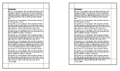
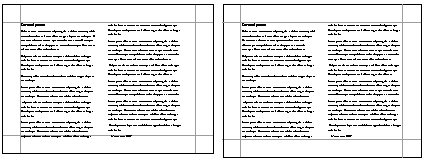
Take a single A4-sheet, and apply the standard 25 mm (approximately 1˝) margins most of us use when preparing letters, reports, articles and the like. The working area -- 160 mm by 247 mm -- is well within the bounds noted above. Fill the page with text, however, and a problem occurs if the document is sent to someone using Letter. To wit:
The text still fits onto a single US Letter sheet, but it spills over the margins. When a Letter-user prints the file, the page will either not print properly (because part of the text is placed into a non-printable portion of the sheet) or will print on a second page. The second result is better but neither is desirable and the second is dependent on too many uncontrollable variables in any event.
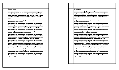
To avoid this problem, the only option for A4-users sharing documents with Letter-users is to increase their bottom margins to 45 mm. This ensures the text on their pages won't extend into the no-go zone when viewed and printed by folks still using Letter. To again show rather than tell:
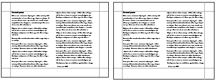
Switching to landscape, it's Letter-users who need to make the bottom-margin adjustments. With a standard 25 mm margin on all sides, a landscape layout that looks fine on Letter-sized paper encroaches into the danger area on A4:
Add an extra 6 mm (about 0.2˝) to the bottom margin and the problem is avoided:
The layouts presented in miniature above are deliberately simple but the suggested margin changes should work even with more complicated grid-based layouts. Troubles can and will arise, however, with layouts built around a centre axis rather than one of the traditional grids.
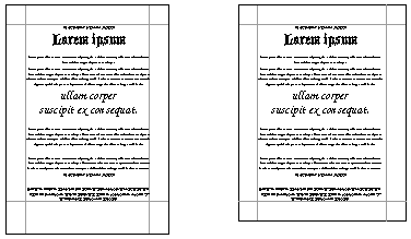
A layout built around only one central axis should still display and print acceptably across the paper-size divide with appropriate margin tweaks. A simple Victorian-style poster, for example, set up along the vertical axis in portrait mode:
A close look reveals one minor display problem. The design is perfectly centred on the A4-sheet but a little off-centre on the US letter page. An unavoidable consequence of two things: 1) A4 and US Letter aren't the same width and 2) almost every tool for laying out and presenting data digitally uses the left-hand top corner of the page as the reference point for determining where objects should appear on the page.
Similar problems will appear with designs built around the vertical axis in landscape mode. If even these minor visual errors are unacceptable there is little option but to prepare two versions of a design (eg a US Letter and A4 version or a US Tabloid and A3 version). Designs built around both the vertical and horizontal central axes will almost certainly need both US and non-US versions prepared in any event.
Avoiding the problem to begin with
If all this seems like trouble you'd be well without, welcome to the club. Unfortunately, the only current alternatives to acknowledging and dealing with the problem are:
ignore it and irritate and/or lose the custom of people who use a different page size to you.
convince the US (and Canada) to abandon their various Imperial measurement systems and whole-heartedly switch to the SI (or metric, to use the less formal term) system.
Most people will end up ignoring the problem. This is only an irritating lapse in manners for people sharing documents for non-commercial reasons, mostly forgiven or at least not commented on by the affected party.
And, despite the magnitude, it is a commonly made commercial error because the lost business is hidden by the relative sizes of the two major economies affected: the US and the EU. Someone operating successfully in one sphere can ignore the other and not notice the lost revenue.
As for the second alternative, and despite my muted optimism above, I don't see it happening in the near future. A switch by fiat (as happened successfully in Australia beginning in 1974) is extremely unlikely and the slow osmosis of metric terms into US life hasn't yet reached the stage where such measures are replacing their imperial equivalents.
Which leaves us where we started: dealing with two slightly different paper sizes and all the inconveniences which flow from the differences.
The original version of this document was written as a background paper for the US-based and now defunct on-line learning firm, ZDU. The remains of ZDU can be found operating as ElementK.