Screenwriters produce an intermediate product. Although a screenwriter has to be a good writer to make a sale (with occasional market-driven exceptions) what they sell isn't what the general public pay money for. Put broadly, screenwriters sell instructions for film-makers. Which is why screenplays have so many technical constraints and requirements.
Prose writers, however, are selling the finished product, so they can please themselves with regards things like formatting and typeface choice, right?
Wrong!
Novel and short-story manuscripts are submitted to editors, assistant editors and literary agents. Unlike producers, studio execs and film agents, these folk do not commonly have an army of readers between them and the writer. Which doesn't mean they don't expect manuscripts to have a particular format and style.
Manuscript format requirements have more to do with production issues than they do pleasing a tired, jaded reader. And said requirements boil down mostly to the following rules, which I've (somewhat arbitrarily) divided into three categories: Typesetting rules, Presentation rules and Cover Page rules.
Typesetting rules
-
Ragged Right, 12/32 Courier.
Your copy should be double-spaced, 12-point Courier (12/32 Courier in typesetter's terms) running ragged-right (ie, don't justify the right-hand margin). Oh, and don't make the mistake of thinking 'double-spaced' means two spaces between each word (don't laugh, I've been sent manuscripts by writers who've made this error).
-
6 pica first line indent.
Establish new paragraphs with a 25mm (1˝) first-line indent. Don't use white space (ie a blank line) for this task. Also, and as much as I don't like it, you should indent even first paragraphs. (I don't like it because it's completely redundant: a first paragraph is obviously a new paragraph. I forebear, however.)
-
Don't be the typesetter/typographer.
Typesetter's quote marks (ie the ‘66’ and ‘99’ versions of apostrophes, speech delimiters and the like rather than the inverted tear-drop character familiar to we former typewriter-users) are fine but resist the temptation to use other tools of the typographer's trade.
Use the double-hyphen (set open) instead of a proper em-dash. Use a single-hyphen (again, set open) instead of an en-dash. Use underline instead of italics. In short, treat your expensive computer as if it had no more typographical capability than an old, manual typewriter.
And, for those who wonder what ‘set open' means, it means put a space on either side of the figure. US typographers tend to prefer em-dashes and en-dashes be set open, UK typographers tend to set them close (ie no spaces either side). Speaking personally, I like to set them with a thin-space either side, but that's not an issue most writers need concern themselves with.
In a mono-spaced manuscript setting the double-hyphen open (
--) makes it easy for the typesetter and editor to see it. And setting the 'hyphen-as-en-dash' open (-) makes it easy to distinquish it from the 'hyphen-as-hyphen' which is always set close. -
Two spaces vs one after the full stop. Who cares?
Don't spend time worrying about whether or not to put one or two spaces after a full-stop (period).
People taught to use typewriters (which had only a single mono-spaced face) will use two spaces as a matter of course. They were taught to do so because it supposedly makes it easier to distinguish between sentence breaks and word breaks in a mono-spaced world.
People taught to type on computers (which generally have a plethora of proportionally-spaced faces to choose from) are taught to use only one space, in imitation of the typesetter's habit.
Editors don't care much one way or the other. Whatever habit you have, don't spend a lot of time trying to break it (unless you get involved in the typesetting of your or someone else's work, at which time you'd better acquire the one-space habit quickly).
It doesn't make a huge difference but recent readability studies suggest the old 'it's easier to read' argument for two spaces on mono-spaced copy holds little-to-no water. That isn't a good enough reason to make people break a life-time's habits, however. If it really begins to bug you just do a quick global search-and-replace before hitting the Print button.
-
Double-quote vs single-quote. Again, who cares?
In the US, most style guides recommend using the double-quote characters (“ ”) for direct speech and the single-quote characters (‘ ’) for indirect speech (ie a speaking character quoting another person to a third-party). In the UK and Australia, the reverse is true.
Don't feel you have to go through your manuscript switching back-and-forth if you decide to market your work across an ocean. So long as you are consistent in your use, the editor won't care and the typesetter will set the copy according to whatever house rules exist regardless of what you've typed anyway.
-
New chapter = new page.
For a novel, start each chapter on a new page. For clarity's sake it's also worth putting 'Chapter X: [chapter name if any]’ on an otherwise blank line at the top of said new page.
-
'#' in manuscript = white space on printed page.
If you have a break within a chapter that you want to establish using white space when the story is printed, put a hash mark (known as the 'pound sign' in the US), indented 25mm (1˝), on an otherwise blank line.
Presentation Rules
-
6 pica margins all the way round.
Your pages should have 25mm (1˝) margins at top, bottom, left and right.
-
Recto printing only.
Your copy should be printed on one-side of the leaf (sheet) only. If you were to bind your manuscript (which you won't do, of course: see below) the text would appear on the right-hand or recto page only. Also, and just in case you're ever asked, the left-hand side of a bound leaf is called the verso.
-
Surname/page count flush right in the header.
On every page except the first page you should have a header running flush right which contains your surname or family name and a page number thus:
Forté/35
Don't get fancy. Don't use 'page x of y' and don't put the title here unless you are submitting more than one work simultaneously.
In this latter case add a single identifying word from the title between your surname and the page number thus:
Forté/Dragons/35
(for a story called 'Here be Dragons') and
Forté/Power/46
(for a story called 'The Boy with the Power'). Finally, if you're working with a co-writer, an appropriate header would look like this:
Bekric/Forte/35
for a single submission or:
Bekric/Forte/Dragons/35
for one out of multiple submissions.
-
No binding: paper clip or box only.
Don't bind your manuscript, in any way. Sorry for the shouting but given the almost fetishistic concern with brads amongst screenwriters it's worth emphasising this point. A short manuscript can be held with a paper-clip and slipped into a manila folder for protection. A long manuscript should probably go into a document box.
Oh, and while we're on the subject: treat your manuscript as disposable. Don't, for the love of all that's decent, send your only copy. A Self-Addressed Stamped Envelope (SASE) or pre-stamped postcard for the 'thanks, but no thanks' note (which, we hope, you won't get) isn't necessary, either, although many writers do include them.
Cover Page rules
-
Contact details in top left-hand corner.
The top left-hand corner of your front page should include all your contact details laid out thus:
name you want on the cheque/contract
mailing address
phone (optional: I include it)
e-mail (optional: I include it)Single space, flush left, ragged right all these details. Underneath the e-mail address I always add the words 'Disposable Manuscript.' It may seem self-evident but it never hurts to spell these things out.
With regards the mailing address, I put my entire address on one-line something like as follows:
1a Smith Street, Norwood 5039 SA, [Australia]
This isn't the post-office preferred layout but it is clear, easy to read, and makes each line on this part of the page a discrete unit of information. (That's not my real address, by the way. It's not even a real address, just in case anyone's tempted to send anything.)
The word [Australia] is also a hint as to why I don't bother with 'post-office preferred layout.' It doesn't appear on a manuscript if I'm sending work to an Australian publisher, but that doesn't happen all that often. The last few years I've sold most of my work outside Oz. And every country's postal system has a preferred address layout unique to their addressing needs. Which means anyone writing back to me will format my address on the envelope to please their post office regardless of how I lay it out on my manuscript.
-
Word count in top right-hand corner.
The top right-hand corner contains a word count thus:
xx,yyy words
Set these two words flush right, on the same line as the name above.
See below regarding how to arrive at this word count.
-
Centre the title and author credit in both directions.
Half-way down the page and centred go the title and 'by credited author/s' lines. It should look something like this:
The Boy With The Power
by Brian Forté
Note the double-spacing between the title and author credit.
Don't write the title in ALL CAPS or put it within quote marks (unless the title is an actual quote).
If you are using a nom de plume, this is the place to put it. Regardless of which name is put in the top left-hand corner of the cover page, the name/s listed on the 'by credited author/s' line will get the byline when and if the story is published.
-
Story starts 64-points below author credit.
Assuming you are still in double-space mode, hit the Return key twice after the author/s line, establish the required first line indent and you're at the right spot to type the first paragraph of your story/novel.
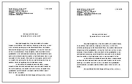
Finally, for the more visually oriented, below are two scaled-down images of a properly formatted manuscript cover-page. The image on the left is a scale represenation of a cover-page on A4, the image on the right is a scale representation on US Letter.
Which brings up another concern that isn't, especially for people coming to straight prose from screenwriting. What paper size should a writer use?
The US film industry is currently bound to US Letter for screenplays. If you live anywhere where A4 reigns supreme you'll need to use US Letter if you find yourself submitting a screenplay to a US production house or agent. (BTW, if it's anything like here in Australia, don't bother looking for pre-cut US Letter: it's easier, if a little more expensive, to get a manufacturing stationer to produce custom reams.)
On the obverse side, film-makers everywhere else on earth use and prefer A4. The one-minute-per-page rule of thumb works just as well for A4 as for US letter and A4 is endemic everywhere outside the US. So, US screenwriters looking for producers outside the US will need to acquire A4 and re-print their screenplays accordingly.
If, however, you are marketing straight prose, you don't need to bother one way or the other. Editors are concerned with word-count-as-column-inch-indicator (see below) not page size. So long as you use the word-count routine below, a US editor isn't going to turn their nose up at A4 any more than a British or Australian editor will look askance at US Letter.
Word counts
Most word processors and text editors have word count features. Unfortunately they are useless for arriving at a word count an editor can use.
Word processor word count algorithms work something like as follows:
If [text string] begins with a [space, non-breaking space, slash, return, line-feed, hyphen] and ends with a [space, non-breaking space, slash, return, line-feed, hyphen, full stop, comma, colon, semi-colon] count as a single word.
An Editor's word count algorithm works something like as follows:
x words = y column inches, where the relationship between x and y changes from magazine to magazine, book to book, leaf-size to leaf-size and typeface to typeface.
A word processor is mostly concerned with counting logical units, an editor is mostly concerned with knowing how much space a given amount of copy will take.
So, if you want to help your editor (and you do, since your editor is the person who authorises accounting to write your cheque), give them a word count that provides some sense of how much space your manuscript will take when turned into a properly typeset masterpiece.
Happily, others have worked out how to do this and all you have to do is follow their lead. To wit:
-
Find 'C'
Find a representative (full) line of text in your manuscript. Count the characters on this line, including spaces. Remember this number 'C'.
-
C/6 = A
Divide 'C' by six (or five or even seven, people can and do get quite passionate on this front). The idea is to generate an 'average number of words per line' figure and the passion comes from those who disagree about how many long words most writers use in the average manuscript.
Whichever divisor floats your boat will probably be fine. In my experience, however, six-letters as an averaging number works best for most writers. Unless you're inclined to be either mono-syllabic or poly-syllabic I'd think carefully about using either 5 or 7. And remember this number, which we'll call 'A'.
-
Find 'L'
Count the number of lines on a full page of text (include any # lines as well). Remember this number, 'L'.
-
A\*L = P
Mutiply 'A' (the average words per line number you arrived at in step 2 above) by 'L' (the number of lines per page) to get 'P', the number of words per page.
-
Find 'T'
Read the number in the header on the last page of your manuscript: this is 'T', the number of pages in your manuscript.
(Anyone wishing to say 'duh' at this point is more than welcome, but I probably won't hire you to write instructional materials or documentation ’coz its the 'obvious' stuff that always trips people up even when following the clearest instructions.)
Also, note this will count page fragments (such as your half-page of text on page one and any last-pages of chapters that don't contain text all the way to the bottom margin) as full pages. We want to do this, honest.
-
P*T = W
Multiply 'P' (the number of words per page from 4 above) by 'T' (the total number of pages in the manuscript). This gives you 'W', the word count. Don't put this on the cover page, however. We have one more step to go.
-
ROUND(W,-2)
The above is fancy-schmancy shorthand for ‘round the word count "W" to the nearest hundred'. The number you arrive at is the number you put on the cover page.
BTW, this is also the number used, in most cases, to work out how much you'll be paid. Short-stories are paid for by the word, which means by the space they take up in the magazine. Your editor may make their own calculation on this front (and probably will if you are new to them) but, after a while, they will likely just use your number -- assuming it looks accurate when compared to the space the typeset version takes up.
Why all the rules?
If you're still with me, you are probably wondering why all these rules. After all, editors don't have to deal with a film-crew of hundreds, or all the thousand-and-one concerns of said crew. You're right, they don't. They have their own production issues to deal with, however, and these format rules -- which date from typewriter days just as screen-writing format rules do -- evolved to make the editor and typesetter's life easier.
Remember the computer vs editor word-count problem above? The editor thinks in terms of column inches (even if it's a single column on a paperback-sized page). Everything about the standard manuscript is designed to make it easier for the editor and typesetter to plan and effect the transformation of your manuscript into properly set copy on the printed page.
Monospace typeface; standard margins; large indent for all paragraphs; chapter starts on new page. These are all required so an editor can tell, at a glance, how much space a manuscript will take in their magazine or how many pages the novel will run. Experienced editors know, sometimes by just looking at a pile of properly formatted manuscript pages, whether a story needs cutting or not.
Double-spacing. This gives the editor room to insert editorial marks and corrections, both for your benefit and the typesetter's.
No typographical niceties. This is mainly for the typesetter. In most versions of Courier, the em-dash and the en-dash aren't sufficiently different to be told apart at a glance. There's no mistaking the double-hyphen for the single-hyphen, however.
The end at last
It's worth noting these rules are, for the most part, just as useful for articles as they are for fiction. On that front, however, it's my experience that paper manuscripts are a thing of the past in non-fiction periodical publishing.
I've been sending copy to newspapers and magazines as plain-ASCII e-mail messages (with appropriate attachments for accompanying images and photos if any) since the mid-1990s. So far as article-writing is concerned, the most important rules to follow are the house style rules of your editor. Find out if they use Chicago or AP or Oxford or NYT in-house, and buy, learn and use the appropriate Style Guides.
On the 'I want my name on the spine' front, these rules really only apply to those seeking to publish book-length works of fiction.
Non-fiction manuscripts, which commonly include charts, pictures, captions, footnotes, end-notes, bibliographies, appendices and so on, operate according to differing rules and standards. Moreover, these rules and standards can and do change from publisher to publisher. Some will spin minor riffs on the Chicago or Oxford Style Guides and others will have complex rules based on internal, automated workflow systems that you'll have to learn if you want to write for them.
Finally, don't forget that none of these rules will help you sell the unsellable.
A good story might sell if you don't follow the rules but it's not a chance I'd take. This game is hard enough as is, why make it more difficult. Conversely a bad story won't be saved from the reject pile just because it is immaculately laid out.
Follow these rules because a properly formatted manuscript looks professional and encourages an editor to hope something worthwhile might be waiting within. It's up to you to ensure the editor's hopes are realised.
Good luck.
The original version of this document as posted to the Screenwriting mailing list.