US Screenplay Presentation

Standard screenplay presentation format. Ask about it on most mailing lists or web-sites or at most screen-writing seminars and you'll get a variation on the following:

20 pound bond US Letter
Card stock covers
3-holes
Brads in top and bottom holes

Which is all well and good but overlooks two things.

  1. These requirements don't apply outside the US film industry.

  2. Even for those marketing their work into the US, this shorthand advice is of no practical value.

These non-standard, non-metric, peculiar to the US (actually, peculiar to the US film industry in particular) requirements represent a real barrier to people outside the United States marketing their work into the US film industry.

Personally I'd love to say ‘stuff it, the rest of the world uses A4, and it's about bloody time you switched.'

That won't help sell screenplays, however. And, given how fetishistic the US film industry is about this stuff, such an attitude will actively harm a writer's chances.

I'd not have believed it myself but I had meetings -- both informal and formal -- with industry folk in LA in late-2001. Readers, agents and producers really do care about this stuff. Mostly because it serves as a shortcut method of reducing the size of their 'have to read this week' pile.

The 'a great story will win out' rule still applies but you make it a lot harder to have your great story read in the US if your material isn't presented as folk there expect.

So, ignoring all questions regarding the quality of your prose, and assuming you know enough to write a Master Scene script using standard margin and tab settings, you've still got work to do making sure what you send doesn't un-necessarily bias a US reader against your work.

Printing it on A4 paper and binding it using the Celco-brand flat-head steel binders common to Australian stationers is probably not a deal-breaker but it's not going to help.

Moreover, if you're entering one of the big three US-based screenwriting competitions -- Nicolls, Austin or Chesterfield -- it could well be a deal-breaker.

The Nicoll Fellowship, for example, officially allows A4 but puts your screenplay at the mercy of the photocopier should you make it to the quarterfinals, as per the following extract from their FAQ:

Q. Living in Europe, I only have access to paper that is longer than standard American paper. Is it acceptable to submit a script on European (A4) paper?

A. Yes, it is. Try to leave a longer bottom margin (2 inches/5 centimeters instead of 1 inch/2.5 centimeters) as scripts that advance to Nicholl quarterfinals will be copied onto standard American paper (8.5 x 11 inches).

The Chesterfield doesn't mention anything about page size but it does require all screenplays entered into the annual competition be bound with 'plain white paper or cardstock and standard brads.'

And while it's past time for the US to switch to the metric system, sending your screenplay to a US screenwriting competition on 2-hole A4-paper with 'non-standard' binders isn't going to convince them of the merits of changing. Which is unfortunate because almost every difficulty presented by US screenplay presentation standards comes down to their dependence on Imperial measures.

The six things to be aware of before sending screenplays to a US reader are:

1. Paper Grade What is 'bond paper?'
2. Paper weight And why does it weigh 20 pounds?
3. Page size 
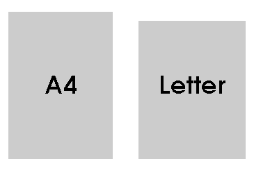
The US uses Letter (aka US Letter); the rest of the world uses A4.
4. Cover Exactly what is 'Card Stock' anyway?
5. Holes Three-holes vs two-holes vs four-holes.
6. Brads And what are these 'Brads' they keep on about?

Following is a detailed look at the specifics of US film industry habit with regards screenplay presentation and the ways to deal with them, given their non-standard nature. If you're only interested in the solutions and not how or why I arrived at them, skip straight down to the bottom where I've presented a short summary.

1. Paper Grade

Go into a stationer's here in Oz and ask for a ream of A4. One thing you won't be asked is 'what paper grade?' You might be asked what weight you want (see below) but, for everyday use, most of us consider paper generically.

Not so in the United States, where Paper Grade is not just of concern to publishers and printers. Everyday folk in the US need at least a passing familiarity with the differences between bond, book, bristol, bible, catalog (sic) and other grades of paper.

If you're interested in such minutae, Jacci Howard Baer has a useful article on Choosing Paper Grades for Desktop Publishing over in the About.com desktop publishing area.

For the rest of us, just note that bond paper -- also known as writing or xerographic paper -- is essentially equivalent to the paper we buy without thinking whenever we need to fill up a photocopier's or laser printer's paper tray.

Of more concern, is the paper's weight.

2. Paper Weight

Americans list paper weights using a complicated and non-intuitive system. So let's start with ours.

Paper weights in Australia (and Europe and England and Asia and pretty much everywhere A-series paper is also used) are listed in grams per square metre (g/m2). In speech, these weights are commonly referred to as 'gee ess emm' as in '80 gsm paper.' (Strictly speaking, the system is 'grams per A0 sheet' but A0 sheets are a square metre by design so the two terms are equivalent.)

Thanks to the simple relationship between each A-series size this system makes it easy to work out what an individual sheet of any sized paper weighs.

If you have 80 gsm A4 sheets, each sheet weighs 5 grams. A single A4-sheet is one-sixteenth the size of an A0-sheet and 80/16 = 5. 100 gsm sheets of A4 each weigh 6.25g. 120gsm A4 weighs 7.5g per sheet. And so on.

The same simple arithmetic applies to other sheets in the A-series. A3-sheets are one-eighth of an A0-sheet. So 80gsm A3 sheets weigh 10 grams each.

In the US things are nowhere near as simple. The so-called basic weight system used in the US works as follows: 500 sheets of Y-grade paper of dimensions A x B weighs Z pounds.

Put another way, a sheet's basic weight is the number of pounds a ream of a specific grade of paper cut to a standard size will weigh. Paper grades used in the US (eg bond, cover, bible and bristol) have no direct analogues outside the US. And each of these grades has a different standard size. Book paper, for example, has a standard size of 635mm by 889mm (25˝ by 38˝). Bond paper, however, has a standard size of 431.8mm by 558.8mm (17˝ by 22˝).

Remember, the actual size of the sheets of paper in front of you aren't important. If you have a ream of US Letter (8.5˝ by 11˝ or 215.9mm by 279.4mm) and it's described as '20 pound bond' the 20 pounds refers to how much the ream would weigh if the sheets were 17˝ by 22˝.

So, how do we relate this to our g/m2 system?

Let's start with the only part of this the two systems have in common: the word 'ream.' 500 sheets is a ream of paper both within and without the US.

The paper grade is a bit of publishing and printing arcana leaking into the everyday realm. The very basics are noted above but, for our purposes, we're only concerned with one grade: bond.

The dimensions used (the so-called ‘standard size' from which the basic weight is derived) are further arcana, since they are trade sizes which have little to do with the sizes used in offices and homes.

As noted above, for bond paper the dimensions used are 17˝ by 22˝ (431.8mm by 558.8mm). That's twice the dimensions of a single sheet of US Letter, which is the actual paper size we are interested in.

And the only weight we care about is 20 pounds, the weight specified as 'standard' by every US-based screenwriting book, site and guru I've come across.

So, 500 sheets of 17˝ by 22˝ bond paper weighing 20 pounds is where we start. 20 pounds is 9.07 kilograms (9070 grams). Divide by 500 and we get the weight of each sheet: about 18 grams.

These standard sheets are 431.8mm by 558.8mm, giving each an area of 241,290mm2 or about 0.2413m2. US Letter sheets are 215.9mm by 279.4mm, giving an area of 60,322.5mm2 or about 0.06032m2.

These aren't particularly friendly numbers but 241,290/60,322.5 is. It's a nice round 4. A 17˝ by 22˝ sheet is four times the area of a sheet of US Letter. So a sheet of 20 pound US Letter should weigh a quarter of a 17˝ by 22˝ standard sheet. And 18/4 gives us a weight per sheet of 4.5 grams.

With a little further arithmetic (4.5/0.06032) we find 4.5 grams per US Letter sheet is pretty close to 75g/m2.

(For those that didn't follow the arithmetic: it's the weight of a single US Letter sheet divided by the area of said sheet. Since the area is expressed as a fraction of a square metre, the answer -- 74.6 to three significant figures -- turns out to be how much a square metre of paper would weigh if a Letter-sized sheet of the same paper weighs 4.5g.)

All of which is the tedious process needed to discover '20 pound bond' is somewhere close to what we'd call '75 gsm' paper.

Don't celebrate just yet. You aren't going to find 75 gsm paper at your local stationers. Standard office-paper is 80 gsm. Depending on how extensive a range your stationer carries you might also find 100 gsm paper and even 70 gsm paper. This latter is considered a 'draft' weight: too light for anything other than testing or checking before the finished document is printed on 80 gsm sheets.

No-one, however, carries pre-packaged 75 gsm sheets. Of course, you can pay a lot extra and get 75 gsm paper made up, but don't bother.

Standard 80 gsm paper cut to US Letter size weighs about 4.8 grams per sheet. 120 sheets of such paper weighs a touch under 580g. (Remembering 120 pages represents a 2-hour screenplay, about as long as you want a spec screenplay to run.) 120 sheets of '20 pound bond' cut to US Letter size weighs 540g.

40g difference in a 600g range (ie a difference of about 7%) is on the threshold of what people can detect by plain heft. I've not checked with anyone but I strongly suspect the difference is too small to care about.

Which brings us to paper size.

3. Page size

80 gsm A4 office paper is easy to find. US Letter, however, is not.

You won't find US Letter at OfficeWorks or Office National or your local stationer or newsagency. This non-standard size must be cut from a standard mill size (probably C3 or A3).

Not every stationer will do this for you. OfficeWorks, for example, doesn't do this sort of special order. An Office National store may -- Office National is a franchise rather than a chain, and services such as custom-paper ordering are in the hands of individual franchisees.

Your best bet is to find a Manufacturing Stationer. Wigg & Sons is a good example of such a stationer and they have offices in Adelaide, Brisbane, Melbourne, Sydney and Perth. According to the Wiggs' retail outlet in Adelaide, 80gsm US Letter costs around A$18.00 a ream, special ordered.

In late-October 2002, an Office National retail outlet in Sydney quoted me A$14.00 a ream for 80gsm US Letter. They also noted the turnaround time on such an order would be 'four to five days minimum.' This because the stationer has 'minimum order sizes with the mill and it takes a while to build-up special orders to the required value.'

The minimum order size concerns the amount of non-standard paper ordered and cut, not the amount of one non-standard size ordered. An informal survey of stationers in several states made it clear US Letter is a vanishingly rare special order size.

So don't depend on even a manufacturing stationer knowing what 'US Letter' is. Some stationers remember it as 'US Quarto,' an old British term, but others have no idea of the paper size, nor its dimensions (215.9mm by 279.4mm). Have these figures to hand before placing your order.

Whether its A$14.00 or A$18.00 a ream, or something inbetween, this is expensive compared to the A$5.00/ream standard A4 sheets cost. On the other hand, it's likely the only option currently available. As of January 2003, ordering US Letter from the United States appears impossible, all questions of cost aside.

Of the major US stationery supply stores only Amazon.com offers any sort of shipping outside the United States. Office Max 'only ships to the 50 US states, Puerto Rico and the US Virgin Islands.' Office Depot does not 'currently accept orders outside the United States.'

And so it is with Staples, which 'can offer delivery only to addresses within the United States.' Staples does have physical stores in the UK and Germany but these stores don't carry US Letter or any other US-specific stationery. Other US-based on-line office supply stores that don't ship outside the US include Quill and Reliable.

Finally, of the two specialist screenwriter's supply stores I'm aware of -- The Writers' Store and Script Supplies -- the former does ship outside the United States but doesn't carry paper and the latter does carry paper but doesn't ship outside the United States.

Which brings us back to Amazon.com. Unfortunately, it turns out their stationery store is simply an Amazon.com-branded front for Office Depot, which I've already noted doesn't ship outside the US.

So, special ordering is the way to go. Only question now: should you also special order the holes?

4. Holes

The three-hole system used in the US was once common in Australia and elsewhere. As metrication has rolled across the globe, however, it has fallen out of use, leaving only vestigal signs of its existence.

Outside the US, the standard for filing loose-leaf paper in folders is a two-hole system described by ISO 838. The fully-documented specifications for this standard are available for sale as either PDF or paper files from the ISO's on-line catalogue.

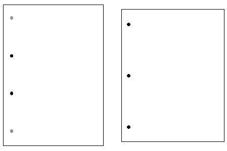
Put briefly, ISO 838 specifies two holes about 6mm in diameter, 80mm apart, 12mm in from the left-edge of the sheet and set symmetrically around the central axis of the sheet. A very common, albeit unofficial, extension of this standard adds two holes 80 mm above and below the central two.

The two-hole system works for sheets as small as A7 (74mm by 105mm) and is widely used in offices, perhaps most commonly in conjunction with those ubiquitous two-hole lever-arch folders.

The upwards-compatible 4-hole system, which isn't useful on anything smaller than A4, is used mostly in education, thanks to the ubiquitous 4-ring folders dispensed by school stationery suppliers.

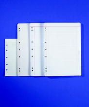
By comparison, the 3-hole system appears to be designed around US Letter alone. The middle hole is just that: drilled 140mm down the page, half-way down the 279.4mm length of a US Letter sheet. The top and bottom holes are then placed 108mm above and below the middle hole.

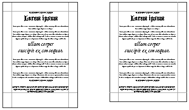
The diagram below shows a scaled down sheet of A4 with black circles representing where the ISO 838-standard holes go. The grey circles above and below are where the extra two holes are punched for four-hole paper. For comparison, I've placed a 3-hole US Letter sheet reduced to the same scale on the right.

4-ring A4 & 3-ring US Letter side-by-side

All this said, pre-drilled paper isn't particularly common at your local stationer. Student A4 pads, pre-lined with 7 pre-drilled holes and a red gum binding down the left-hand edge are common enough but hardly suitable for printing screenplays.

Morover, almost all pre-drilled paper available in Australia follows the student pad pattern of having 7 holes. This makes it possible to slip the paper into 2-ring, 4-ring and even old 3-ring folders but, again, doesn't make the paper useful for our purposes.

Which leads us back to the question above: when special-ordering a ream of US Letter, should you also get it pre-drilled?

Every OfficeWorks store I'm aware of has a copy centre in-house which offers a range of binding services including hole-drilling. As of January 2003 they charge A$1.10 per hole per half-ream. And they don't charge extra for odd-paper sizes. Getting three holes drilled in a ream of US Letter will, therefore, set you back A$6.60.

By contrast, Wigg & Sons Adelaide quoted A$10.00 extra for pre-drilling special ordered US Letter.

Finally, if you'll be needing a lot of drilled paper, I can recommend the Open D-4 Adjustable Drill Hole Punches. At A$150.00 they aren't cheap (although I've seen them for less and picked up mine for less than A$100.00) but they have pre-sets for the US 3-hole system and can take over 100 sheets of 80 gsm paper in one go.

A$150.00 will get nearly 23 reams of US Letter pre-drilled at an OfficeWorks copy centre, enough for nearly 100 screenplays. Against that, OfficeWorks Copy Centres aren't open late at night and, with two high-school students plus an academic in my household, the Hole Punches get used for a lot more than preparing screenplays.

5. Covers

Standard advice for US screenplay covers -- front and back -- is that they be left completely blank and be made of 'card stock.'

Card stock, which is also known as index paper, turns out to be another of those paper grades everyday people have to keep track of in the US. It's a stiff paper often used for index card catalogues (hence the alternative name). It's basic weight is derived from a standard size of 647.7mm by 774.7mm (25.5˝ by 30.5˝) and the most common basic weight appears to be 110 pounds (almost 50kg).

Running through the arithmetic very quickly: a basis weight of 50kg means a single sheet of 647.7mm by 774.7mm card stock weighs 100g. Which means a single US Letter-sized sheet of card stock weighs 12g.

Without torturing you with further arithmetic, this equates to 200 gsm paper.

200 and 250 gsm paper isn't that hard to find, but it's mostly sold as A2 sheets called Colourboards. Despite this name, they can be had in white (the recommended colour for screenplay covers).

A single A2 250 gsm White Colourboard costs around A$1.00. Copy centres which offer custom trimming will turn five such sheets into ten US Letter-sized covers for between A$0.40 and A$0.60, although you'll likely have to measure up the outlines yourself. Every copy centre I called offered rulers and scoring knives in-house.

Custom trimming is commonly charged per trimmed edge per five sheets. It takes four trims to cut two US Letter sheets out of an A2 sheet. For example, if a copy centre charges A$0.10 per trim per five sheets, we get the A$0.40 noted above.

Getting three holes drilled is charged at the same rate noted above: A$1.10 per hole per half-ream. Given this, I'd recommend getting cover-holes drilled at the same time as you get your reams of US Letter drilled. At least one person I spoke to at an OfficeWorks Copy Centre suggested they could ‘slip the trimmed Colourboards in as part of the 80 gsm drilling.' Not a huge saving (and not even a guarantee of one) but better than nothing.

Which leaves us, finally, with those strange objects the US film industry demands slide into these holes.

6. Brads

Let's get the word out of the way first. In most of the English-speaking world, dual-pronged widgets for holding piles of paper together are called paper fasteners or paper binders. In the US film industry, however, these same widgets are called brads.

Brad comes, via Middle English, from the Old Norse 'broddr' meaning spike.

The word has a long history in British and American English but has fallen out of regular use outside the US film industry. Even here it's use appears to be a relatively recent extension of an older meaning.

According to the American Heritage Dictionary, brads are 'thin wire nails with a small head or a slight side projection instead of a head.'

One of several secondary meanings, however, is 'a small wire nail, with a flat circular head.' It's not much of a stretch from this to the US film-industry use: a brass or brass-coloured, round-head, dual-pronged paper fastener; more specifically an Acco-brand #5 Solid Brass Fastener. The Acco-brand widgets are the particular 31mm-long fasteners US film-folk mean when they say 'brads.'

Unfortunately, knowing what brads are won't help you find them at a stationers. Acco Australia does not distribute #5 Solid Brass Fasteners locally. According to Acco Australia's Marketing Manager, John Verdigan, 'it's only a A$50,000.00-a-year market. It doesn't really get onto our radar.' Those dollars aren't all spent by screenwriters entering US competitions and marketing to US prodcos, BTW. According to Verdigan these style fasteners are also used in legal circles.

Both Celco and Premier-Grip (the latter distributed in Australia by Esselte) produce similar fasteners to the Acco #5s but neither is an adequate substitute, at least for screenwriters. They are apparently fine for binding lawyer's briefs.

Celco produces a 31mm Paper Fastener which is gold-coloured and has a rounded head. Acco #5s have a 12mm head, however, where the head on the Celco fastener is only 8mm in diameter. The extra 4mm ensure the Acco-brand fasteners don't slide throught the holes. As well, the Celco fasteners are tin, with narrower prongs and a gold flake coating. They are fine for holding a few pages together but aren't up to the task of keeping 120 pages from falling apart.

Premier-Grip also offer a gold, round-headed 31mm paper fastener. It has almost identical construction as the Celco fastener except for the head, which is only 6mm in diameter.

Which leaves two choices: import them or buy them in the US.

On this latter front I'll note three things. When I was in the US for several months in late 2001, they weren't as easy to find as you might think. I wandered into half-a-dozen Office Depot, Office Max and Staples stores in Austin, San Francisco and even Los Angeles looking for brads without luck. That's not to say they weren't there, just that I couldn't find them. That said, my LA-native host couldn't find them in the Office Depot and Staples stores we tried in Los Angeles either. (For accuracy's sake I'll also note there aren't any Staples stores in Austin, Texas or there weren't any as of November 2001).

I ended up buying my supply of brads from The Writers' Store walk-in shopfront on Westwood Boulevard in Los Angeles.

The second thing to note. While I was in the Writers' Store I made sure to pick up a collection of Acco Round-Head Solid Brass Washers. It turns out the washers don't come in the box. A little nugget worth remembering if, like me, you are used to buying Celco-brand steel binders which include steel washers in the box.

Finally, when buying brads in the US to bring back to Australia, don't put them in your hand luggage. I didn't do this but I did have to explain what 'all that metal' was every time my stored luggage was x-rayed (which was at every airport: given the number of EU, Chinese, British, New Zealand and Australian passports I saw each time my luggage and I were searched I'm inclined to believe non-US folk get the bulk of US airport security staff attention).

I'm confident anyone putting packs of 31mm, sharp, pointed metal into their hand luggage will lose said packs and spend more time than they'd like getting through security.

Finally, you can buy Acco-brand fasteners and washers on-line. Be prepared for some serious sticker shock, however.

The Writers' Store offers Acco-brand #5 brads at US$8.00 for a box of 100 and Acco-brand #2 Round-Head Solid Brass Washers at US$2.50 for a box of 100.

Converted to Australian dollars at US$0.70 per Australian dollar (a conservative rate as of April 2004, albeit astonishingly high to those of us who remember the late-1990s and rates of US$0.49 to the A$1.00) this is around A$15.00 for 100 brads and 100 washers.

This isn't the worst of it. Next are the shipping charges.

The Writers' Store web-site appears to offer only one international shipping method: Federal Express (FedEx) International Priority. Said method adds US$43.00 to the cost.

Which makes a box of Acco brads and an accompanying box of Acco washers cost A$76.50!

On the up-side, the FedEx cost doesn't change much as you increase the number of boxes ordered. If you order 20 boxes of brads and 20 boxes of washers, the FedEx bill only goes up to US$53.00. A$15.00 for 100 paper fasteners and 100 washers is exhorbitant but getting a mob of fellow screenwriters together to order the widgets en masse will make the freight easier to bear.

If you don't have extra screenwriters handy, there is an unpublicised alternative. Vince Afner, Product Fulfillment Manager at The Writers Store, let me know by e-mail that people can 'state in the comment field they would like their order shipped by post [ie standard mail --BF] and The Writers' Store will not charge their card for the FedEx rate even though the order lists the FedEx rate.'

Afner further noted the cost of shipping a package via US mail is 'around US$10.00' (about A$14.00).

Finally he wrote the Store is 'working on cheaper rates for our international customers.' [April 2004 addendum: they appear to still be 'working' on this --BF]

I didn't test this procedure out and A$29.00 (A$15.00 for brads and washers plus A$14.00 postage) is still very expensive but it's a lot less than A$76.50.

Folk in Britain used to have a local source of Acco #6 brads (6mm longer than #5 brads): the London-based Screenwriters' Store. As of April 2004 at least they no longer carry these items.

Conclusion

A$14.00 for a ream of 80 gsm US Letter.
A$16.60 to drill 3 holes.
A$10.00 for ten sheets of 250 gsm Colourboard.
A$10.40 to trim into 10 covers.
A$29.00 to ship 100 Acco #5 brads & #2 washers from LA.

A$50.00 Total.

And I've quoted in the low range and I haven't factored in labour costs, time and petrol spent running around, the postage or the cost of entering any of the competitions.

If you're entering one of these competitions, make your screenplay as good as you possibly can, and then make it a little better.

And start hassling any American you know about going Metric.

Summary

1. Bond Paper Bond is the term used in the US to describe everyday writing and printing paper. If your sheets can be safely run through a photocopier or laser printer they are close enough to bond for our purposes.
2. 20 pounds 20 pound bond is equivalent to 75gsm. Don't bother hunting for this weight. 80 gsm, which is the standard paper weight used for photocopy and laser printer paper, will be fine.A 120-page screenplay printed on 80 gsm US Letter paper will be about 40g heavier than 120-pages of 75 gsm. Too small a difference to worry about.
3. US Letter You can't get it off the shelf in Australia. You can special order it from some stationers. Using 80 gsm paper as the base, it will cost anywhere from A$14.00 to A$18.00 a ream.

Don't assume the stationer knows the page's dimensions, which are 215.9mm by 279.4mm. It can take up to five days for the order to arrive.

4. Holes Pre-drilled paper is rare and pre-drilled 3-hole paper is (for practical purposes) non-existent. Getting special-ordered US Letter pre-drilled will add around A$10.00 to the price.

Alternatively, take your special ordered ream to an OfficeWorks Copy Centre and get it 3-hole drilled for A$6.60. OfficeWorks drilling machines should have pre-sets for the 'US 3-hole system' so ask for that by name.

Heavy paper users can bring one step of the process in-house with an Open D-4 Adjustable Drill Hole Punch. They cost A$150.00.

5. Cover Card Stock is a heavy grade of stiff paper which equates to 200 gsm. 200 or 250 gsm paper is easiest to get locally as A2 Colourboards, running about A$1.00 per sheet. Buy them in lots of five.

Do this because custom trimming tends to be charged per five sheets and per trimmed edge. A copy centre that offers custom trimming will charge from A$0.40 to $A0.60 per five sheets to make four cuts into five A2 sheets to produce ten US letter-sized covers. You'll likely have to rule up where to make the trims yourself, however.

6. Brads Acco #5 Solid Brass Paper Fasteners (aka Brads) and their accompanying Acco #2 Solid Brass Washers are not available locally. No equivalent substitute is available either.

A box of 100 brads and a box of 100 washers will set you back at least A$29.00 if ordered from The Writers' Store. You'll get this price only if you ask for standard mail in the Comments field of the order page. Without this request the brads will be shipped International FedEx, upping the price to more than A$75.00. This latter extravagance can be ameliorated by ordering brads in bulk (eg by a group) since the FedEx shipping only increases marginally when you bulk up the order.

A4 vs US Letter

Ever downloaded a document or received a file from a friend only to have it print out badly? There are lots of potential causes of such problems: different typefaces available to the creator and the printer; different operating systems and different versions of the same operating systems exposing limitations in supposedly cross-platform standards; different printer engines, especially when crossing between ink-jet and laser; and so on.

An oft-overlooked cause of problems, however, is different paper sizes. When people in the US and Canada reach for a sheet of paper to write or print on, chances are they reach for a piece of Letter-sized paper (also known as US Letter), measuring 8.5˝ by 11˝. With few exceptions, when people everywhere else reach for a sheet of paper to write or print on, they reach for a piece of A4-sized paper, measuring 210mm by 297mm.

A quick conversion between inches and millimetres shows the two sizes aren't all that different:

  Millimetres Inches  
  Width Length Width Length
A4 210.0 297.0 8.26 11.69
Letter 215.9 279.4 8.50 11.00

And a scale representation of each page size reinforces the closeness of the two paper sizes.

A4 and US Letter side-by-side size comparison

Which raises the question, why the difference at all? If both sizes are arbitrary, why bother with maintaining a difference. The answers are long and involved, and mostly outside the scope of this article. At the core, however, it comes down to one thing: A4 isn't an arbitrary size.

A4 Described

A4 is part of the ISO 216-series of related paper sizes known more commonly as the A-series. This series starts with the large A0 sheet and a quick look at this large sheet of paper shows why these various sheets are the sizes they are.

A0 sheets of paper are 841mm by 1189mm. Again, apparently arbitrary. Multiply the two numbers together, however, and it becomes a little clearer: 841 * 1189 = 999,949mm squared or 0.999949m squared (ie just a smidgen under a square metre of paper). For all practical purposes, an A0 sheet contains a square metre of paper.

So why not make it a 1m by 1m sheet? Because of another non-arbitrary consideration: the aspect ratio or relationship between the height and width of each sheet.

1189/841 = 1.413793103448276. Not particularly memorable, unless you happen to be maths-geeky enough to see the similarity between it and √2 (the square-root of 2, an irrational number which starts thus: 1.414213562373095). Round both numbers to four significant figures and you get the same value: 1.414.

So, the aspect ratio of an A0 sheet of paper is, again for practical purposes, one as to the square-root of two or 1:√2. And again, I hear the cries: ‘so what!'

A ratio of 1:√2 is more than a mathematical oddity. It doesn't have a nifty name, like the famous Golden Ratio or Golden Mean. It does, however, have a nifty property. Divide a rectangle with sides 1:√2 along the longest side and the smaller rectangle you create has the same aspect ratio. (Markus Kuhn suggested in correspondence we call the ratio the Lichtenberg Ratio, after Professor Georg Christoph Lichtenberg, the German enlightenment figure who first proposed the ratio as a basis for paper formats in 1786.)

Getting back to the ratio (named or not) and its nifty property: if we start with a honking great sheet of A0 paper:

Scale view of an A0 sheet of paper

We can easily, and quickly, derive all the other A-series sizes by folding or dividing thus:

A0 divided down to A8

In less visual terms, any sheet of A-series paper is as long as the next-larger sheet is wide and half as wide as the next-larger sheet is long. To wit:

Sheet name Width (mm) Length (mm)  
A0 841 1189
A1 594 841
A2 420 594
A3 297 420
A4 210 297
A5 148 210
A6 105 148
A7 74 105
A8 52 75

There are other benefits to this relationship between paper sizes, not least of which is when you want to scale a particular layout. If you've ever wondered why photocopiers offer a 71% reduction option wonder no more: 0.71 is approximately equal to (√2)/2 or √0.5. This makes it perfect for reducing an A3-layout onto an A4 sheet, or an A4 layout onto an A5 sheet or, more commonly, reducing two A4-sheets side-by-side -- say in a journal -- neatly and without fuss onto one A4-sheet. The equally common 141% option is, of course, perfect for enlarging from one A-series sheet up to the next (eg A4 to A3). Most important, because each sheet has the same aspect ratio, objects retain their relative shapes: squares don't become rectangles and circles don't become ellipses.

If nothing else, this constancy of relationship makes A-series paper simpler to work with than older paper sizes such as Brief (13˝ by 16˝, and the source of the 'briefs' lawyers still use) or Foolscap (27˝ x 17˝) and its near-letter sized derivative, Foolscap Quarto (13.5˝ by 8.5˝, commonly if erroneously called 'Foolscap').

Add in a clear connection to the metric (or, more properly, the SI) measuring system and the rise in popularity of A-series paper is fairly easy to understand: as the world has slowly but surely gone metric, so A-series paper has become more popular. In Australia, for example, the metric system was adopted officially in 1974, the same year A-series paper (and related series such as the C-series for envelopes) started to become the standard.

US Letter Described

The clear connection to the metric system is also a partial explanation for the continued use of Letter-sized paper in the US and Canada. The US is almost the only country left not to have made the switch from non-metric measures, making the particular advantages of A4 less evident. As well, although US paper sizes are as arbitrary as is sometimes contended, they aren't impossible to work with.

There is no derived starting point (equivalent to the 1 square metre for A0) for US paper sizes but the two most popular sizes -- Letter and Tabloid -- are part of an old American National Standard Institute standard for technical drawing paper. This standard (ANSI/ASME Y14.1) had five paper sizes swinging back-and-forth between two different aspect ratios:

Sheet name Width (˝) Length (˝) Aspect Ratio  
A (Letter) 8.5 11.0 1.294
B (Tabloid) 11.0 17.0 1.545
C 17.0 22.0 1.294
D 22.0 34.0 1.545
E 34.0 44.0 1.294

This isn't as elegant or convenient as A-series paper but enlarging and reducing particular layouts whilst retaining internal relationships isn't especially difficult. Just skip a paper size when travelling in either direction.

It's worth noting that neither aspect ratio has any particular mathematical properties. And there being two aspect ratios isn't surprising: fold any rectangle in half that doesn't have sides in ratio 1:√2 and the smaller rectangle's sides will be in a different ratio to each other. Fold the smaller rectangle in half again and this third rectangle will have sides in the same ratio as the one you started with.

This simple property is why rectangles with sides in ratio 1:√2 are so nifty: they are the only ones in which the two ratios you get folding back-and-forth are equivalent and interchangable.

And the sheer utility of this interchangability is why I believe older paper sizes such as US Letter will eventually disappear, even in the US. For example, the current version of the ANSI standard noted above -- ANSI/ASME Y14.1m-1995 -- recognises the older paper sizes for legacy purposes only, setting A-series paper as the preferred US standard for technical drawings.

Moreover, I understand A-series paper -- especially A4 -- is slowly becoming the norm in US colleges and universities, if for no other reason than making it easier for students and staff to photocopy articles from (inevitably A4-sized) journals.

Finally, globalisation exacts its toll: US companies doing business with officialdom outside the US (especially the EU) are finding they must submit proposals, tenders, diagrams and so on on A-series paper.

Looking for the right file format

Which is all well and good, but doesn't solve the immediate problem: how can anyone designing documents today for use in North America and the rest of the world ensure their designs don't fail because of the differences between A4- and Letter-sized paper?

First, and in reference to all the other potential causes of problems alluded to above, don't send or distribute documents that depend on external factors to display and print properly. So, no Word documents, no Quark XPress documents, no PageMaker files, no AppleWorks files and so on.

Even if you are certain the person receiving your files has the same version of the same application, all the typefaces you've used and is using the same printer, none of these file-formats are safe to send across the paper-size divide. They fail at this last point because they still depend on external factors to display and print.

For example, a Word document formatted with 25 mm margins on Letter-sized paper will re-flow the text it contains when opened on a computer which defaults to displaying documents on A4. Even straight prose running in a single column will re-paginate under such circumstances. Anything more complex (eg, a mix of text and images or a screenplay) will almost certainly appear incorrectly at the receiving end under such conditions.

(I'd even go so far as to suggest sending discrete text files (ie a text file sent as an attachment to an e-mail message rather than being made part of the message body) is out, if only because of the still extant 'which line-ending did they use' problem but this is a separate problem.)

The list of document types not to send is fairly lengthy. The list of document types that can be sent is rather short: raw PostScript files and Adobe Acrobat (aka 'pdf') files.

Both file formats encode and fix the spatial relations between individual elements on a page. Generating raw PostScript files is relatively simple: set your computer to print to a PostScript-capable printer (even if you don't have one available) and then 'print' your document to a file. The file produced this way is safe to send. Unfortunately, the file can't be viewed on a screen without engaging in some serious geekery and can only be reliably printed by sending it to a PostScript-capable printer.

Acrobat files: best of a bad lot

Which, by default, makes Acrobat files the best option. I say 'by default' because Acrobat files wouldn't be my first choice. The file-format is only semi-open and Acrobat files are larger than I'd like them to be, when compared to the amount of information encoded within them. There's also the small point of cost.

Once you've bought a copy of Word, it doesn't cost anything more to create a Word document. Likewise with other document creation tools like Quark XPress, WordPerfect, PageMaker and so on.

By contrast, Acrobat isn't marketed or sold as a document creation tool. Adobe describes Acrobat as:

a universal file format that preserves all the fonts, formatting, graphics, and color of any source document, regardless of the application and platform used to create it [emphasis added --BF]

Roughly speaking, Acrobat is a successor to PostScript. Like PostScript, Acrobat is a programming language designed to exactly define where on a page objects should be placed. As well, Acrobat includes some occasionally nifty tools for turning these well-defined pages into forms capable of handling new data on-the-fly.

From the perspective of someone seeking to distribute formatted pages, the key difference between Acrobat and PostScript is the Adobe Acrobat Reader. Where Adobe charges money for people to include a PostScript interpreter in their products (part of the reason PostScript printers cost more than non-PostScript printers) the Acrobat interpreter (ie Acrobat Reader) is freeware, available for download and included as part of almost every computer or operating system purchase.

Which sounds great until you have to create an Acrobat file and realise Adobe has merely changed who they charge. PostScript files are free to create (PostScript printer drivers are free) but cost money to view (PostScript printers are expensive compared to non-PostScript printers).

Acrobat files are free to view (Acrobat Reader is free) but cost money to create (no Adobe-brand tools for creating Acrobat files are free).

Creating Acrobat files

Adobe offers several tools for creating Acrobat files, beginning with a web-based service which you can trial for nothing and subscribe to for US$10.00/month or US$100/year. This service is only available to residents of the US and Canada.

For the rest of us (and for US and Canadian folk who prefer an up-front cost to an ongoing subscription fee) there's Adobe Acrobat, which Adobe charges US$250.00 for but which can be had from retailers for around US$220.00.

Adobe also offers a range of more expensive products in the Acrobat family designed around the needs of corporate workflow.

And, for the adventurous, there are various third-parties that take advantage of Acrobat's semi-open nature to provide Acrobat creation tools without Adobe's formal seal of approval. A good place to start digging for info regarding such tools is The PDF Zone.

Preparing files for Acrobat

So, with the final file-format decided, and tools for creating said format in hand, it's time to deal with the document layout.

At first glance it seems relatively simple: restrict your designs and layouts to an area which both sizes can accomodate.

If you place an A4- and Letter-sized paper one atop the other, with their top left-hand corners touching, the differences between the two sheets is obvious: Letter is wider than A4; A4 is longer than Letter. So, for a design or layout to fit safely on both sheet sizes it must be no wider than A4 and no longer than Letter. Put another way, the limits for a design or layout which will fit safely on either page size are the width of an A4 sheet (210mm or 8.27˝) and the length of a Letter sheet (11˝ or 279.4mm). Unfortunately, it's not quite so simple.

Take a single A4-sheet, and apply the standard 25 mm (approximately 1˝) margins most of us use when preparing letters, reports, articles and the like. The working area -- 160 mm by 247 mm -- is well within the bounds noted above. Fill the page with text, however, and a problem occurs if the document is sent to someone using Letter. To wit:

A4 & US Letter with margins and text demonstrating overflow when A4 layouts are transferred to US Letter

The text still fits onto a single US Letter sheet, but it spills over the margins. When a Letter-user prints the file, the page will either not print properly (because part of the text is placed into a non-printable portion of the sheet) or will print on a second page. The second result is better but neither is desirable and the second is dependent on too many uncontrollable variables in any event.

To avoid this problem, the only option for A4-users sharing documents with Letter-users is to increase their bottom margins to 45 mm. This ensures the text on their pages won't extend into the no-go zone when viewed and printed by folks still using Letter. To again show rather than tell:

A4 & US Letter with margins and text demonstrating larger A4 bottom margin preventing text overflow

Switching to landscape, it's Letter-users who need to make the bottom-margin adjustments. With a standard 25 mm margin on all sides, a landscape layout that looks fine on Letter-sized paper encroaches into the danger area on A4:

A4 & US Letter with margins and text demonstrating overflow when Letter layouts are transferred to A4

Add an extra 6 mm (about 0.2˝) to the bottom margin and the problem is avoided:

A4 & US Letter with margins and text demonstrating larger Letter bottom margin preventing text overflow

The layouts presented in miniature above are deliberately simple but the suggested margin changes should work even with more complicated grid-based layouts. Troubles can and will arise, however, with layouts built around a centre axis rather than one of the traditional grids.

A layout built around only one central axis should still display and print acceptably across the paper-size divide with appropriate margin tweaks. A simple Victorian-style poster, for example, set up along the vertical axis in portrait mode:

A4 & US Letter with centred design demonstrating centring along one axis not being a particular problem

A close look reveals one minor display problem. The design is perfectly centred on the A4-sheet but a little off-centre on the US letter page. An unavoidable consequence of two things: 1) A4 and US Letter aren't the same width and 2) almost every tool for laying out and presenting data digitally uses the left-hand top corner of the page as the reference point for determining where objects should appear on the page.

Similar problems will appear with designs built around the vertical axis in landscape mode. If even these minor visual errors are unacceptable there is little option but to prepare two versions of a design (eg a US Letter and A4 version or a US Tabloid and A3 version). Designs built around both the vertical and horizontal central axes will almost certainly need both US and non-US versions prepared in any event.

Avoiding the problem to begin with

If all this seems like trouble you'd be well without, welcome to the club. Unfortunately, the only current alternatives to acknowledging and dealing with the problem are:

  1. ignore it and irritate and/or lose the custom of people who use a different page size to you.

  2. convince the US (and Canada) to abandon their various Imperial measurement systems and whole-heartedly switch to the SI (or metric, to use the less formal term) system.

Most people will end up ignoring the problem. This is only an irritating lapse in manners for people sharing documents for non-commercial reasons, mostly forgiven or at least not commented on by the affected party.

And, despite the magnitude, it is a commonly made commercial error because the lost business is hidden by the relative sizes of the two major economies affected: the US and the EU. Someone operating successfully in one sphere can ignore the other and not notice the lost revenue.

As for the second alternative, and despite my muted optimism above, I don't see it happening in the near future. A switch by fiat (as happened successfully in Australia beginning in 1974) is extremely unlikely and the slow osmosis of metric terms into US life hasn't yet reached the stage where such measures are replacing their imperial equivalents.

Which leaves us where we started: dealing with two slightly different paper sizes and all the inconveniences which flow from the differences.

Manuscript Presentation

Screenwriters produce an intermediate product. Although a screenwriter has to be a good writer to make a sale (with occasional market-driven exceptions) what they sell isn't what the general public pay money for. Put broadly, screenwriters sell instructions for film-makers. Which is why screenplays have so many technical constraints and requirements.

Prose writers, however, are selling the finished product, so they can please themselves with regards things like formatting and typeface choice, right?

Wrong!

Novel and short-story manuscripts are submitted to editors, assistant editors and literary agents. Unlike producers, studio execs and film agents, these folk do not commonly have an army of readers between them and the writer. Which doesn't mean they don't expect manuscripts to have a particular format and style.

Manuscript format requirements have more to do with production issues than they do pleasing a tired, jaded reader. And said requirements boil down mostly to the following rules, which I've (somewhat arbitrarily) divided into three categories: Typesetting rules, Presentation rules and Cover Page rules.

Typesetting rules

  1. Ragged Right, 12/32 Courier.

    Your copy should be double-spaced, 12-point Courier (12/32 Courier in typesetter's terms) running ragged-right (ie, don't justify the right-hand margin). Oh, and don't make the mistake of thinking 'double-spaced' means two spaces between each word (don't laugh, I've been sent manuscripts by writers who've made this error).

  2. 6 pica first line indent.

    Establish new paragraphs with a 25mm (1˝) first-line indent. Don't use white space (ie a blank line) for this task. Also, and as much as I don't like it, you should indent even first paragraphs. (I don't like it because it's completely redundant: a first paragraph is obviously a new paragraph. I forebear, however.)

  3. Don't be the typesetter/typographer.

    Typesetter's quote marks (ie the ‘66’ and ‘99’ versions of apostrophes, speech delimiters and the like rather than the inverted tear-drop character familiar to we former typewriter-users) are fine but resist the temptation to use other tools of the typographer's trade.

    Use the double-hyphen (set open) instead of a proper em-dash. Use a single-hyphen (again, set open) instead of an en-dash. Use underline instead of italics. In short, treat your expensive computer as if it had no more typographical capability than an old, manual typewriter.

    And, for those who wonder what ‘set open' means, it means put a space on either side of the figure. US typographers tend to prefer em-dashes and en-dashes be set open, UK typographers tend to set them close (ie no spaces either side). Speaking personally, I like to set them with a thin-space either side, but that's not an issue most writers need concern themselves with.

    In a mono-spaced manuscript setting the double-hyphen open ( -- ) makes it easy for the typesetter and editor to see it. And setting the 'hyphen-as-en-dash' open ( - ) makes it easy to distinquish it from the 'hyphen-as-hyphen' which is always set close.

  4. Two spaces vs one after the full stop. Who cares?

    Don't spend time worrying about whether or not to put one or two spaces after a full-stop (period).

    People taught to use typewriters (which had only a single mono-spaced face) will use two spaces as a matter of course. They were taught to do so because it supposedly makes it easier to distinguish between sentence breaks and word breaks in a mono-spaced world.

    People taught to type on computers (which generally have a plethora of proportionally-spaced faces to choose from) are taught to use only one space, in imitation of the typesetter's habit.

    Editors don't care much one way or the other. Whatever habit you have, don't spend a lot of time trying to break it (unless you get involved in the typesetting of your or someone else's work, at which time you'd better acquire the one-space habit quickly).

    It doesn't make a huge difference but recent readability studies suggest the old 'it's easier to read' argument for two spaces on mono-spaced copy holds little-to-no water. That isn't a good enough reason to make people break a life-time's habits, however. If it really begins to bug you just do a quick global search-and-replace before hitting the Print button.

  5. Double-quote vs single-quote. Again, who cares?

    In the US, most style guides recommend using the double-quote characters (“ ”) for direct speech and the single-quote characters (‘ ’) for indirect speech (ie a speaking character quoting another person to a third-party). In the UK and Australia, the reverse is true.

    Don't feel you have to go through your manuscript switching back-and-forth if you decide to market your work across an ocean. So long as you are consistent in your use, the editor won't care and the typesetter will set the copy according to whatever house rules exist regardless of what you've typed anyway.

  6. New chapter = new page.

    For a novel, start each chapter on a new page. For clarity's sake it's also worth putting 'Chapter X: [chapter name if any]’ on an otherwise blank line at the top of said new page.

  7. '#' in manuscript = white space on printed page.

    If you have a break within a chapter that you want to establish using white space when the story is printed, put a hash mark (known as the 'pound sign' in the US), indented 25mm (1˝), on an otherwise blank line.

Presentation Rules

  1. 6 pica margins all the way round.

    Your pages should have 25mm (1˝) margins at top, bottom, left and right.

  2. Recto printing only.

    Your copy should be printed on one-side of the leaf (sheet) only. If you were to bind your manuscript (which you won't do, of course: see below) the text would appear on the right-hand or recto page only. Also, and just in case you're ever asked, the left-hand side of a bound leaf is called the verso.

  3. Surname/page count flush right in the header.

    On every page except the first page you should have a header running flush right which contains your surname or family name and a page number thus:

    Forté/35

    Don't get fancy. Don't use 'page x of y' and don't put the title here unless you are submitting more than one work simultaneously.

    In this latter case add a single identifying word from the title between your surname and the page number thus:

    Forté/Dragons/35

    (for a story called 'Here be Dragons') and

    Forté/Power/46

    (for a story called 'The Boy with the Power'). Finally, if you're working with a co-writer, an appropriate header would look like this:

    Bekric/Forte/35

    for a single submission or:

    Bekric/Forte/Dragons/35

    for one out of multiple submissions.

  4. No binding: paper clip or box only.

    Don't bind your manuscript, in any way. Sorry for the shouting but given the almost fetishistic concern with brads amongst screenwriters it's worth emphasising this point. A short manuscript can be held with a paper-clip and slipped into a manila folder for protection. A long manuscript should probably go into a document box.

    Oh, and while we're on the subject: treat your manuscript as disposable. Don't, for the love of all that's decent, send your only copy. A Self-Addressed Stamped Envelope (SASE) or pre-stamped postcard for the 'thanks, but no thanks' note (which, we hope, you won't get) isn't necessary, either, although many writers do include them.

Cover Page rules

  1. Contact details in top left-hand corner.

    The top left-hand corner of your front page should include all your contact details laid out thus:

    name you want on the cheque/contract
    mailing address
    phone (optional: I include it)
    e-mail (optional: I include it)

    Single space, flush left, ragged right all these details. Underneath the e-mail address I always add the words 'Disposable Manuscript.' It may seem self-evident but it never hurts to spell these things out.

    With regards the mailing address, I put my entire address on one-line something like as follows:

    1a Smith Street, Norwood 5039 SA, [Australia]

    This isn't the post-office preferred layout but it is clear, easy to read, and makes each line on this part of the page a discrete unit of information. (That's not my real address, by the way. It's not even a real address, just in case anyone's tempted to send anything.)

    The word [Australia] is also a hint as to why I don't bother with 'post-office preferred layout.' It doesn't appear on a manuscript if I'm sending work to an Australian publisher, but that doesn't happen all that often. The last few years I've sold most of my work outside Oz. And every country's postal system has a preferred address layout unique to their addressing needs. Which means anyone writing back to me will format my address on the envelope to please their post office regardless of how I lay it out on my manuscript.

  2. Word count in top right-hand corner.

    The top right-hand corner contains a word count thus:

    xx,yyy words

    Set these two words flush right, on the same line as the name above.

    See below regarding how to arrive at this word count.

  3. Centre the title and author credit in both directions.

    Half-way down the page and centred go the title and 'by credited author/s' lines. It should look something like this:


    The Boy With The Power


    by Brian Forté


    Note the double-spacing between the title and author credit.

    Don't write the title in ALL CAPS or put it within quote marks (unless the title is an actual quote).

    If you are using a nom de plume, this is the place to put it. Regardless of which name is put in the top left-hand corner of the cover page, the name/s listed on the 'by credited author/s' line will get the byline when and if the story is published.

  4. Story starts 64-points below author credit.

    Assuming you are still in double-space mode, hit the Return key twice after the author/s line, establish the required first line indent and you're at the right spot to type the first paragraph of your story/novel.

Finally, for the more visually oriented, below are two scaled-down images of a properly formatted manuscript cover-page. The image on the left is a scale represenation of a cover-page on A4, the image on the right is a scale representation on US Letter.

scale representations of A4 & Letter-sized cover pages

Which brings up another concern that isn't, especially for people coming to straight prose from screenwriting. What paper size should a writer use?

The US film industry is currently bound to US Letter for screenplays. If you live anywhere where A4 reigns supreme you'll need to use US Letter if you find yourself submitting a screenplay to a US production house or agent. (BTW, if it's anything like here in Australia, don't bother looking for pre-cut US Letter: it's easier, if a little more expensive, to get a manufacturing stationer to produce custom reams.)

On the obverse side, film-makers everywhere else on earth use and prefer A4. The one-minute-per-page rule of thumb works just as well for A4 as for US letter and A4 is endemic everywhere outside the US. So, US screenwriters looking for producers outside the US will need to acquire A4 and re-print their screenplays accordingly.

If, however, you are marketing straight prose, you don't need to bother one way or the other. Editors are concerned with word-count-as-column-inch-indicator (see below) not page size. So long as you use the word-count routine below, a US editor isn't going to turn their nose up at A4 any more than a British or Australian editor will look askance at US Letter.

Word counts

Most word processors and text editors have word count features. Unfortunately they are useless for arriving at a word count an editor can use.

Word processor word count algorithms work something like as follows:

If [text string] begins with a [space, non-breaking space, slash, return, line-feed, hyphen] and ends with a [space, non-breaking space, slash, return, line-feed, hyphen, full stop, comma, colon, semi-colon] count as a single word.

An Editor's word count algorithm works something like as follows:

x words = y column inches, where the relationship between x and y changes from magazine to magazine, book to book, leaf-size to leaf-size and typeface to typeface.

A word processor is mostly concerned with counting logical units, an editor is mostly concerned with knowing how much space a given amount of copy will take.

So, if you want to help your editor (and you do, since your editor is the person who authorises accounting to write your cheque), give them a word count that provides some sense of how much space your manuscript will take when turned into a properly typeset masterpiece.

Happily, others have worked out how to do this and all you have to do is follow their lead. To wit:

  1. Find 'C'

    Find a representative (full) line of text in your manuscript. Count the characters on this line, including spaces. Remember this number 'C'.

  2. C/6 = A

    Divide 'C' by six (or five or even seven, people can and do get quite passionate on this front). The idea is to generate an 'average number of words per line' figure and the passion comes from those who disagree about how many long words most writers use in the average manuscript.

    Whichever divisor floats your boat will probably be fine. In my experience, however, six-letters as an averaging number works best for most writers. Unless you're inclined to be either mono-syllabic or poly-syllabic I'd think carefully about using either 5 or 7. And remember this number, which we'll call 'A'.

  3. Find 'L'

    Count the number of lines on a full page of text (include any # lines as well). Remember this number, 'L'.

  4. A\*L = P

    Mutiply 'A' (the average words per line number you arrived at in step 2 above) by 'L' (the number of lines per page) to get 'P', the number of words per page.

  5. Find 'T'

    Read the number in the header on the last page of your manuscript: this is 'T', the number of pages in your manuscript.

    (Anyone wishing to say 'duh' at this point is more than welcome, but I probably won't hire you to write instructional materials or documentation ’coz its the 'obvious' stuff that always trips people up even when following the clearest instructions.)

    Also, note this will count page fragments (such as your half-page of text on page one and any last-pages of chapters that don't contain text all the way to the bottom margin) as full pages. We want to do this, honest.

  6. P*T = W

    Multiply 'P' (the number of words per page from 4 above) by 'T' (the total number of pages in the manuscript). This gives you 'W', the word count. Don't put this on the cover page, however. We have one more step to go.

  7. ROUND(W,-2)

    The above is fancy-schmancy shorthand for ‘round the word count "W" to the nearest hundred'. The number you arrive at is the number you put on the cover page.

    BTW, this is also the number used, in most cases, to work out how much you'll be paid. Short-stories are paid for by the word, which means by the space they take up in the magazine. Your editor may make their own calculation on this front (and probably will if you are new to them) but, after a while, they will likely just use your number -- assuming it looks accurate when compared to the space the typeset version takes up.

Why all the rules?

If you're still with me, you are probably wondering why all these rules. After all, editors don't have to deal with a film-crew of hundreds, or all the thousand-and-one concerns of said crew. You're right, they don't. They have their own production issues to deal with, however, and these format rules -- which date from typewriter days just as screen-writing format rules do -- evolved to make the editor and typesetter's life easier.

Remember the computer vs editor word-count problem above? The editor thinks in terms of column inches (even if it's a single column on a paperback-sized page). Everything about the standard manuscript is designed to make it easier for the editor and typesetter to plan and effect the transformation of your manuscript into properly set copy on the printed page.

Monospace typeface; standard margins; large indent for all paragraphs; chapter starts on new page. These are all required so an editor can tell, at a glance, how much space a manuscript will take in their magazine or how many pages the novel will run. Experienced editors know, sometimes by just looking at a pile of properly formatted manuscript pages, whether a story needs cutting or not.

Double-spacing. This gives the editor room to insert editorial marks and corrections, both for your benefit and the typesetter's.

No typographical niceties. This is mainly for the typesetter. In most versions of Courier, the em-dash and the en-dash aren't sufficiently different to be told apart at a glance. There's no mistaking the double-hyphen for the single-hyphen, however.

The end at last

It's worth noting these rules are, for the most part, just as useful for articles as they are for fiction. On that front, however, it's my experience that paper manuscripts are a thing of the past in non-fiction periodical publishing.

I've been sending copy to newspapers and magazines as plain-ASCII e-mail messages (with appropriate attachments for accompanying images and photos if any) since the mid-1990s. So far as article-writing is concerned, the most important rules to follow are the house style rules of your editor. Find out if they use Chicago or AP or Oxford or NYT in-house, and buy, learn and use the appropriate Style Guides.

On the 'I want my name on the spine' front, these rules really only apply to those seeking to publish book-length works of fiction.

Non-fiction manuscripts, which commonly include charts, pictures, captions, footnotes, end-notes, bibliographies, appendices and so on, operate according to differing rules and standards. Moreover, these rules and standards can and do change from publisher to publisher. Some will spin minor riffs on the Chicago or Oxford Style Guides and others will have complex rules based on internal, automated workflow systems that you'll have to learn if you want to write for them.

Finally, don't forget that none of these rules will help you sell the unsellable.

A good story might sell if you don't follow the rules but it's not a chance I'd take. This game is hard enough as is, why make it more difficult. Conversely a bad story won't be saved from the reject pile just because it is immaculately laid out.

Follow these rules because a properly formatted manuscript looks professional and encourages an editor to hope something worthwhile might be waiting within. It's up to you to ensure the editor's hopes are realised.

Good luck.

Field Notes From Inside A Car

The Anthropologist's Guide to Aggressive Drivers

Take away our styled hair, cotton underwear and antiperspirant and what are you left with? The Savannah-dwelling, hunter-gatherer social hominids we like to pretend we aren't.

This less sophisticated truth is a useful thing to keep in mind, however. Especially when forced to slam on the brakes behind that aggressive moron who's very existence is threatened if they don't get one car further ahead of everyone else.

Because aggression isn't useful for either hunting or gathering. Aggressive hunters end up pinned to the wrong end of the deer antlers or mammoth tusks. It's the careful planners who stay un-punctured and able to bring home the bacon (or venison or mammoth steaks).

Aggressive gatherers aren't any better. Roots, tubers, fruits, berries and nuts don't come labeled and packaged in the wild. Bringing home the groceries takes concentrated effort and attention to detail, not reckless running about with a fierce stare and a bad attitude.

Which is not to say aggression has no value to our inner hunter-gatherer. It serves two functions, both social.

First, aggression is used, mostly by males, to fend off competitors when seeking a mate. Second, aggression is used to ward off things which scare us spitless. Much in the fashion of the frill-necked lizard, which presents its impressive skin flaps and nasty hiss only when panicked.

So, the next time you swerve to avoid an aggressive idiot, take heart. Underneath the dark glasses and surly sneer is an insecure jerk who's afraid you'll steal their (likely imaginary) bed-mate. Either that or they're scared generally and are hoping everyone will just go away and leave them alone.

A Hypothesis Regarding 4x4 Frequency Distribution

My son recently suggested 4-wheel drives are distributed on our city streets in Starbucks end-of-the-universe fashion. Spend time walking around almost any US city and you'll understand what he means. In the San Francisco Bay Area, for example, there are more than 400 Starbucks. As you leave one Starbucks it's likely you'll see another just down the street.

And so it is with the truck-like four-wheel-drives lumbering through our streets. As one thunders past, chances are there'll be another somewhere within view.

Not quite herding, but definitely keeping within range of each other. And I think I've got an idea why: it's a silent affirmation they are not alone.

Let's face it, no-one else likes these monster trucks masquerading as family sedans. They're twice as tall and twice as heavy as they need to be. They roll over if you sneeze too hard when cornering. They're ugly. And they are a very public statement that the driver is too self-involved to give a damn about the people beside them who can't turn, overtake or even brake safely because of these hypertrophic panderings to juvenile fantasies of rugged individuality.

In such circumstances, I'd want to keep others like me within sight as well. Anyone driving such a monstrosity down a suburban street to drop their kids off to school clearly doesn't have much of a conscience. Social pressure isn't so easy to ignore in public, however. If there's always at least one other four-wheel-drive in view, such drivers can take some comfort from knowing there are others out there just as selfish.

Yet Another Reason to be Pleased You Bought a Station Wagon

When my children were younger they would pass the time on long car journeys (ie anything more than a five minute trip) playing ‘spot-a-bug.'

It's a pretty simple game. You look for Volkswagens and, as soon as you see one, shout out ‘spot-a-bug.' The first to do so wins the round. Keeping track of how many rounds you win was officially part of the rules but individual victories were much more important than extended counts.

Today both my kids are in high school and the game has changed. As we head in to school each morning, or around to their various after-school activities, I'm regularly assailed with cries of 'MLC.'

They aren't talking about the National Australia Bank's finance and insurance company.

MLC stands for ‘Mid-Life Crisis' and the cry goes up each time they see a 40-plus man driving by in an over-powered, too-small-to-be-practical-for-family-use, sports-car. Judging by the regularity of the shout, there are quite a few MLCs out and about each day.

A few days ago my son claimed to have seen ‘the king of MLCs.' When asked to defend the claim he pointed calmly to the stream of on-coming traffic: ‘over-50; balding; round, mirror-sunnies; grey pony-tail hanging down; driving a brand-new, black Monaro.'

We could hardly argue with him.

Despite being only a little younger than these MLCs, I find my kids' attitude refreshing. It's refreshing because it is only one part of a general perspective -- shared by their friends -- that finds substance more interesting than surface and style. It's not the aging skin they are laughing at, it's the gawdy plumage tacked on to cover the wrinkles.

So, fair warning to anyone looking to assauge the sudden onset of mortal dread with impractical but phallic cars. Those beautiful young people smiling and pointing as you pass by aren't laughing with you.

A Multi-Country Address Entry Form Template

Filling out forms isn't high on most people's lists of fun things to do, even on a rainy afternoon. And web-based forms are less fun than most, despite their being electronic and theoretically amenable to all sorts of nifty automation.

The general lameness of web browsers as a user interface aside, my own irritation meter hits the red zone almost any time I'm called on to enter my address details. I live and work in Australia but many of my commercial dealings on-line are with firms outside the Lucky Country. This often makes filling in the address forms presented by these firms an adventure and occasionally makes it impossible.

Just kvetching about these forms, however, doesn't improve my on-line experience, although it does satisfy other, less noble, regions of the soul. So, in a vague imitation of the spirit of sharing (and in honour of the deadline I almost missed because this little project was more interesting, if not better paying) I offer the following basic form:


Billing & Shipping Address

Name:
Street:
City or Town:
Zip or Post Code:
 
State or Province: Australia
Canada
USA
Other
 
Country: Australia
Canada
Great Britain
New Zealand
South Africa
United States of America
Other

This first go at a multi-country friendly address entry form is deliberately biased towards residents of the English-speaking world. I've assumed an English-language form will be used primarily by English-speaking folk.

Adapting this form for use in other languages isn't difficult, however. On a Portugese-language site, for example, the country radio buttons and state pop-up menus would be switched to refer to Portugal and Brazil with those of us coming from elsewhere still able to fill out the form thanks to the 'Other' text-entry fields. Similarly with a Spanish-language site, where the radio buttons and pop-up menus should provide push-button convenience to folk in Mexico, Spain, Argentina and so on.

The goal is to make things as easy as possible for the majority of those filling out the form without unnecessarily inconveniencing visitors or customers coming from unexpected quarters.

If this form looks like something you'd be interested in using or at least twiddling with, please feel free. You can grab a copy using the Show Source or equivalent command in your browser or download just the form as either a StuffIt or PKZip archive. The StuffIt archive contains a BBEdit text file called form.html complete with Mac OS line endings (ie CR) and ready for use on a Mac OS box. The PKZip archive contains a generic text file called form.htm complete with DOS line endings (ie LF/CR), equally useable on a Mac OS box but better suited to folks using a PC.

Just in case it's not obvious, the above form isn't hooked into any back-end process. You can fill it in to your heart's content but it can't pass the data entered on to anything. The form also doesn't include much in the way of error-checking. It has a few front-end features which should make it relatively easy for any CGI to check for user errors but anyone wanting client-side error checking will need to re-write the form using ECMAScript or some such.

Also, before anyone asks, yes Great Britian has counties and South Africa has provinces, each of which are broadly equivalent to the states and provinces of Oz, the US and Canada. They aren't used as part of postal addresses, however. New Zealand, so far as I am aware, doesn't have administrative regions between the local (ie town and city) and national levels. For more information on address layouts used in various parts of the world the International Address Formats site maintained by the folks at BitBoost is an excellent starting point.

The Statute of Queen Anne

Sometime towards the middle of June 2000, on the StudioB Computer Book Publishing mailing list, Bruce Epstein wrote:

I see the day when a bookseller decides that the way to compete is to acquire unique content and not sell it to other booksellers, perhaps.

The feeling of historical deja vu generated by this sentence is too great to ignore.

English language copyrights derive from Royal patent grants. These grants offered certain people (mostly printers and booksellers) monopoly rights to publish books and pamphlets and the like.

The original purpose of these grants wasn't to protect an author's or even a publisher's right to the material. Rather it was to generate tax revenue and to make it easy for central authority to control what was and was not published.

The system worked quite well (for booksellers, at least) for more than two-hundred years. It started to fall apart, however, when the 1707 Act of Union made the informal joining of England and Scotland (they'd long shared a monarch) into the formal United Kingdom of Great Britain.

Suddenly Edinburgh and Glasgow booksellers were supposed to accept the monopoly publishing rights of the London Stationers' Company (which had achieved this monopoly in the 1500s under the regulatory authority of the Court of the Star Chamber). The Scottish booksellers refused to give up their patent grants, despite the dissolution of the Scottish parliament, and over the next three years the British House of Lords was regularly concerned with this problem. The end result was the Statute of Queen Anne, which was signed into English law in 1710.

(BTW, Queen Anne, who reigned from 1702 - 1714, had little input into the statute. Much of her energy were devoted to her husband, George, Prince of Denmark. What time she had left was rather pre-occupied with the War of Spanish Succession, which the English won against the French, the struggles between the reformist Whigs and the royalist Tories in the parliament and the ongoing concern with succession in Scotland and England. She didn't do much in the way of pushing the furniture style which bears her name either.)

This remarkable Statute created the modern copyright system, recognising for the first time that authors should be the primary beneficiary of the monopoly rights granted by a copyright. The other important thing the Statute of Queen Anne did was to make copyright a limited monopoly right. Prior to 1710, booksellers could and did hand down royal grants of copyright to their sons. Old Tom's Almanac, for example, made several generations of English booksellers a very good living. In 1710 monopoly copyrights were, for the first time, limited to a fixed period (28 years in the original statute), after which a work passed into the Public Domain.

I'm certain Bruce Epstein wasn't advocating a return to the pre-1710 state of things but encouraging booksellers to return to the old practice may not be such a good idea, at least from the creator's point-of-view.

For what it's worth, I think the British Lords of 1710 got it right and we'd do well to remember their reasons for acting as they did.

First, they didn't consider copyright some inalienable civil or human right. Copyright is a government-granted monopoly right designed to encourage people to produce creative works. The Law Lords saw these works as being in the public good. They believed offering a form of monopoly protection to creators would ensure more and better works would appear. (They believed rightly as it turned out: post the Statute of Queen Anne saw one of the great flowerings of literature in Britain.)

Second, they strictly limited the life of this monopoly right. Since the right was granted primarily because it was seen that more and better creative works would be a public benefit, it followed that eventually the public should have access to that benefit directly. The original 28 year life of a granted copyright has been extended several times (most recently in the US by the so-called Sonny Bono law which extends copyright out 75 years after the copyright owner's death) but it is still a limited right.

It worries me that people have begun to use language reminiscent of the civil rights movement when describing copyrights. It mostly comes from people high up in organisations like the RIAA and various Hollywood studios but I've seen similar language used on the StudioB list and other writing-related lists.

Copyright isn't on a par with the right to life, liberty, fraternity and equality before the law. It's a privilege extended to us by our fellow citizens because they recognise the value they get out of our efforts. Let's not forget writers (and all artists) are in the service industry. If we start telling people they should feel privileged that we deign to offer our masterpieces for their purchase and edification they will -- quite rightly -- tell us all to f#$& off and die.

On Being Burgled

On December 30 1999, my suburban Adelaide home was burgled. Thieves broke in through a locked window and stole a VCR; 101 CDs; $110 in cash (from my childrens' piggy banks); a cricket bag; and a school bag. The last two items were used to carry the other goods. The thieves also left a mess more upsetting than the property loss.

My family was out, buying uniforms for my daughter's first year at high school. I was and still am working on an out-of-town contract (I am the very model of the modern flexible worker).

There are several pluses to all this, however. No-one was hurt and none of the stolen goods had real emotional value. I've also learnt three important lessons.

1. The police are criminally under-staffed.

There were obvious signs of intrusion, including muddy footprints in the kitchen and damage to a kitchen window and back door. Despite this, no specialist evidence gathering was done. The police believe the burglary was the work of drug addicts and further suggested that the goods had already been sold on. The chances of us seeing the stolen goods again are somewhere between Buckley's and none and the chances of the burglars being caught appear to be the same.

This is not to attack the three pleasant and professional officers who arrived promptly on my wife's call. In the end, however, they were little more than sympathetic visitors. My wife was initially asked that the house be left as it was. When the officers were leaving, however, she was encouraged to 'begin tidying up.' No further investigation of the scene would take place.

2. Victims of crime are not fit to judge perpetrators.

Since the burglary I've entertained several revenge fantasies, some of them horribly brutal and none of them commensurate with the actual harm done. Which is worrying since a drug addict's life is already awful. For them, joy and love and the hope of a better future have disappeared into a constant need for something that doesn't even make them feel good anymore.

This doesn't temper my anger. I'm incapable of overcoming my heart's desire to make these low-lifes hurt and hurt and hurt again, knowing all the while that each blow is pay-back for the helplessness I hear in my wife's voice, for the fear I hear in my daughter's voice, for the appalling effort to be 'the man of the house' I hear in my ten-year-old son's voice.

My cold hatred for these unknown people makes me unwilling to render fair judgement on them. It also makes me grateful for a formal judicial system that attempts (however imperfectly) to render justice rather than revenge.

One more beneficial side-effect of this rage: politicians and demagogues who push cold-blooded revenge fantasies masquerading as 'law-and-order' will be easy to ignore. I'll just file their names in my mental 'beneath contempt' drawer along with the burglars.

3. Making drug use illegal is stupid, counter-productive and morally indefensible.

The burglary occurred because the substance these thieves are addicted to is illegal. This illegality means there is no government oversight regarding costs. So cocaine, which is cheaper to produce than booze, ends up more expensive because it is supplied by organised crime, which takes greater risks and demands higher profits than legitimate business.

Illegality also increases the risks to end-users. With no surety of supply and no quality control it is difficult for people to use even cheap drugs like heroin and live an otherwise normal life. And don't try blaming this burglary on the thieves being stoned. This crime was committed by stone-cold sober people. If they had adequate drug supply they'd be doped up somewhere, not tearing my house apart looking for quick cash.

I'm not advocating drug use. My only drug is caffeine (taken orally as a carbonated, highly sweetened cola, especially when deadlines loom) and a few habits of self-discipline would make even this unnecessary.

Nonetheless, if someone chooses to use a mind-altering substance, their choice, in and of itself, doesn't harm anyone. So long as a drug user doesn't drive a car, operate other machinery or otherwise put themselves in a position of responsibility whilst under the drug's influence they won't hurt me or my kin.

The vast majority of adults use drugs, and most of them do so without causing harm to others. So why put useless barriers in the way of those who want to use drugs other than alcohol, nicotine and caffeine?

Making other mind-altering substances illegal doesn't protect us from the consequences of drug use. In fact, our current prohibitionist policies thrust my children into the heart of the problem. Made them victims just as thoroughly as if they'd been using the drugs themselves.

Making other mind-altering substances illegal doesn't make it easier for the police to investigate and solve crime. Instead, it increases the number of offences until there are so many they aren't equipped to properly deal with any of them.

Making other mind-altering substances illegal doesn't improve anyone's moral character. Instead, it leaves me with a withering hatred for people I don't even know. People I should, by all rights, be wanting to help are now the targets of a most uncharitable enmity that does me no credit and them no good.

Three life-lessons in one night. A personal record. It's almost a wonder I don't feel fulfilled and re-born.

A Quick and Dirty Guide to TraceRoute

TraceRoute started life as a small utility developed by Van Jacobson in 1988. Originally developed for various flavours of Unix, and distributed as compilable C source code, there are now versions of the utility for VMS, Mac OS, Mac OS X, OS/2 and the various flavours of Windows.

Windows 95/98/Me and Windows NT/2000/XP all include a TraceRoute application, called tracert, as part of each OS's collection of TCP/IP utilities. In each case the application is available from a DOS prompt.

There are also Windows applications with TraceRoute functionality for folks uncomfortable with the DOS prompt, including Holger Lembke's 3d Traceroute and Visual Trace Route from IT Lights Software.

OS/2 includes a TraceRoute utility as part of the OS and like its Windows counterparts, the OS/2 TraceRoute tool is available from the OS/2 command line.

I understand, but have not specifically confirmed, Windows 3.11 users are catered for by the presence of a DOS-based TraceRoute utility with almost every WinSock-based TCP/IP stack.

Mac OS X, Linux and other Unix and Unix-like operating systems (eg *BSD, Solaris and Irix) all come with TraceRoute available at any shell prompt.

There is an X-Windows implementation of TraceRoute available -- Xtraceroute -- but it hasn't been updated since 1999 and has only been tested on a few Unix implementations (old versions of Solaris and Irix and a single Linux release).

On pre-OS X versions of the Mac OS, Brian Christianson's freeware WhatRoute provides Ping, Whois, Query, Monitor and Finger services as well as acting as a TraceRoute utilitiy. Alternatively, version 6.3 of Interarchy (the last version which runs on Mac OS 8.5 through 9.1) from Stairways Software includes a TraceRoute function in that application's Watch menu.

Both WhatRoute and Interarchy are also available in OS X-only versions and these versions provide TraceRoute functionality for Mac OS X-using folks uncomfortable with opening a shell prompt.

Usage

To create a traceroute log under Unix, Linux or Mac OS X simply type 'traceroute [destination]' (where '[destination]' is the IP number or domain name of the machine you wish to trace to) at any shell prompt and hit Enter or Return.

The process is similar under the CLI-based/DOS-based traceroute applications available under Windows or OS/2: fire up a DOS prompt and type 'tracert [destination]' (without the quotes and with the appropriate numbers or words in place of '[destination]') and hit Return.

WhatRoute and Interarchy for Mac OS both provide a text box in which you simply type the IP number or domain name you are heading for. Likewise with 3d Traceroute and Visual Trace Route under Windows. In all these cases, hit the Return key after you are done typing. (In WhatRoute also check the pop-up menu (which allows you to choose which service you want to access) is set to TraceRoute.)

Once TraceRoute has a machine name or IP number in hand it goes out and does its simple but rather nifty thing.

TraceRoute sends out very small (typically 40 byte) UDP datagrams with even shorter Time To Live (TTL) counters in the packet header. The TTL value in a packet header is the number of routers the packet is set to travel through before a router is allowed to throw it away (presuming it doesn't reach its stated destination beforehand of course).

Examples are always easier so, presume you are setting out to create a traceroute log for the router path between your machine and the ZDU home page at welcome.zdu.com. TraceRoute sends out a UDP datagram with its destination set to welcome.zdu.com and its TTL set to one.

The router at your ISP receives the packet and reduces the TTL value by 1. Since this reduces the TTL to 0, the router promptly discards the packet. At the same time it also creates an Internet Control Message Protocol (ICMP) error message (TIME_XCEEDED_INTRANSIT, to be precise) and sends this error to the sender address on the packet (ie, your machine).

TraceRoute receives this error message and does several clever things with it. First it pulls the IP number of the issuing router out of the ICMP, then it does a DNS reverse look-up on that router. Finally, it logs the time it took for the packet to make what is, in effect, the round trip.

TraceRoute sends out three such packets for each value of TTL specified. Almost invariably TTL=30 is the maximum number used, although it is possible to change that if you wish.

TraceRoute continues to send out its little three packet bursts (each burst with a TTL one higher than the previous) until it reaches the router marked as the destination in the IP packet header. TraceRoute's last trick is played here. The destination router un-wraps the packet to see what to do with it only to discover that the little datagram is aimed at port 33434, a ludicrously high port number with no known use. (By way of example, HTTP services -- ie web sites -- are commonly served up on port 80.) This also generates an ICMP error message, but not a TIME_XCEEDED_INTRANSIT error. Instead the final routers sends an invalid port error message, which traceroute interprets as the end of the line.

The end result is the TraceRoute log: a table of IP numbers, domain names (if they are returned by the reverse DNS look-up) and times. There are three times per router (ie per IP number/domain name) and said times are normally given in milliseconds.

Logs

To put this in concrete, consider the traceroute log I generated below from an HP-UX machine in Victoria, Australia to welcome.zdu.com.

times (in ms) Router Domain Name Router IP #
4.3 4.3 4.2 cbl-gw.cbl.com.au 203.24.198.1
92.4 28.1 82.0 brat4500-d0.netconnect.com.au 203.63.211.33
57.7 72.5 87.3 cor1.mel.connect.com.au 203.63.115.242
63.4 70.6 60.9 ethernet0-3.mel.connect.com.au 203.8.183.62
353.7 329.4 442.3 mixserial.LosAngeles.mci.net 204.189.208.125
365.3 * 309.0 core1-fddi-0.LosAngeles.mci.net 204.70.170.17
520.9 312.9 * core3-hssi-1.Bloomington.mci.net 204.70.1.142
427.3 377.8 * core-hssi-2.Boston.mci.net 204.70.1.45
395.1 516.6 * core-hssi-2.Boston.mci.net 204.70.1.45
390.5 374.7 * border3-fddi-0.Boston.mci.net 204.70.2.35
539.2 * 426.8 m-serve-info-sys.Boston.mci.net 204.70.22.34
464.4 * 430.7 cleveland.east.microserve.net 207.44.7.21
422.3 440.4 439.5 cleveland0.east.microserve.net 207.44.7.17
442.0 * * pitt0.east.microserve.net 207.44.7.13
515.7 428.4 470.1 inet1.east.microserve.net 198.69.185.206
453.7 * * harris.microserve.net 198.69.92.26
475.9 513.3 * 206.228.78.67 206.228.78.67
500.9 530.3 * welcome.zdu.com 204.183.205.204

The HP-UX box gets its TTL=1 packet back from its uplink router (cbl-gw.cpl.com.au) in about 4.27ms (averaging the three times logged). The round trip time for the TTL=2 packets varies rather wildly, with two packets taking about 85ms to make the trip and one taking only 28ms.

It's important to note that these times are not cumulative. The numbers returned are the round trip times taken for the packet to go from the originating machine all the way to the machine which kills the packet and returns the error message and back again.

Things go along pretty smoothly until we hit router 5, the first router outside Australia. Suddenly the round-trip is taking about six times as long as the trip to router 4. Moreover, I'm losing packets with monotonous regularity (the '*' entries in the table are packets which didn't make it back at all). Solid evidence that the Telstra to MCI link across the Pacific ocean is in dire need of an upgrade (as if more evidence was needed, but that's a whole political story for elsewhere).

More generally this points to the usefulness of traceroute logs for rooting out bottlenecks between you and your target. Any sudden increase in the round-trip time when hopping from one router to the next is a strong indicator of the latter router being a bottleneck. Lots of lost packets after a particular router are another indicator of problems, although lost packets are probably best investigated with Ping.

In the case above it's the Telstra-to-MCI gateway, which is why I personally use an ISP which doesn't use Telstra's US link at all (they have their own gateways to San Diego, London and several South-East Asian countries).

Connection Quality

Finally, traceroute can help get a sense of the quality of your personal Internet connection.

Run TraceRoute to the hostname of your ISP. So, traceroute to earthlink.com if you are an EarthLink subscriber; aol.com if you use AOL; telstra.com if you're stuck with Telstra; internode.com if you're with Internode and so on. (NB, you don't have to TraceRoute to your ISP's main host, but it does makes for a short trip, which gets results back to you quicker.)

Take note of the round-trip times for the second machine on the resultant list of computers between you and your ISP's main host. This second machine will likely be the router directing traffic between you and the outside world. (Especially if you have broadband, the first machine is almost certainly your own router, routing traffic from your home LAN or computer up the link to your ISP.)

If you have dial-up connectivity, a 300ms or so round-trip to this router is a sign of decent connectivity. Anything much over this and there is something slowing things down.

If you have broadband connectivity (eg a DSL, ADSL or cable connection), a round-trip to this 2nd machine shouldn't take more than 50ms or so.

It's important to note a single slow round-trip isn't automatically a sign there is something wrong. Even having all three packets take 'too long' to get back isn't a reason to call tech support. If, however, you get consistent slow returns over time, it's worth looking for a cause (remembering, of course, the problem may well be at your end: don't assume slow returns from your ISP's main router are your ISP's problem).

An Alternative History of Australian Football

The Year is 1997. The month is September. Finals time. And a more hotly contested, more widely open to upset finals series is not within living memory. For the first time since the inception of the National Football League almost six years ago the final five consists of teams from five different states.

The West Adelaide Eagles have scraped into the minor premier's spot with a 3 point victory over Launceston in the final minor round game. The win edges them ahead of Freemantle, now relegated to second position on percentage. In third spot, only a game away, is the Northern Territory, rejuvenated in the season's second half by two key players returning after injury. Hobart sits in fourth place two games further behind. But the real excitement is the first appearance in the final five of a Victorian team. In fifth spot, a point behind Hobart and a point ahead of Port Adelaide, is Williamstown Ports, created from the merger, in '95, of Williamstown and Port Melbourne from the old VFA.

The Directors of the NFL could not be happier. Back in 1990 the alternatives facing them are either a slow death in isolation (as the old SANFL was suffering) or a quicker one in capitulation (as the old WAFL was undergoing) The bold notion of actually taking on the AFL seems to be, at the very least, a way of going down fighting. Now, in 1997, an almost complete victory seems within sight.

Back in '94 the decision to invite the VFA to join the NFL is widely held to be more provocative and more dangerous than either the initial step, in 1992, of combining the WAFL, the TFL and the SANFL into the NFL, or the further expansion in '93 to include composite clubs drawn from the district leagues of Sydney and Brisbane and a composite team from the Northern Territory The prospect of taking the battle for Australian Football right into the heart of AFL territory is, however, too grand to resist.

With the success of Williamstown Ports the NFL now has the very real prospect of a Finals game in Melbourne. Already negotiations are underway with the Melbourne Cricket Club. If Williamstown Ports makes it through the Elimination Final in Hobart, the NFL wants the First Semi-Final played at the MCG. For something this big the rules which gave home ground rights in finals to the team placed higher on the ladder can and will be pushed aside.

The stage is set for the most exciting finals series in the history of Australian Football. The Managing Director of the NFL sits in his office and allows himself an almost wicked smile. He is about to put a call through to his counterpart in the AFL; this year it will be their job to adjust their fixtures, to play their finals on Sundays and Monday nights. The phone rings. It is the AFL chief calling; they have to talk, he's heard rumours that one of the AFL teams is considering an offer to join the NFL, he's worried about the future of the two leagues in general, neither side can afford the bidding war currently raging, both need to consider opening up a dialogue and working towards some sort of negotiated settlement, maybe even a coalition approach with an end of season Super-Finals series until the TV contracts run out followed by a fair and equal merger. The NFL chief leans back in his chair and puts his feet up on the desk. By this time the smile is one of utter triumph.

No this is not just some blind fever dream. All of the above might sound fanciful, even impossible. Nonetheless, in another time and another place, under a different code and in a different country, most of what is described above actually took place.

The year is 1959, the country is the United States, the national winter sport is Gridiron and The National Football League, or NFL, comprising sixteen teams, is its governing body. Al Davis from Oakland California, Lamar Hunt of Dallas, and others, want to expand the league and acquire NFL franchises in cities and states where it doesn't currently operate but the NFL doesn't want to know. So on August 14th 1959 Lamar Hunt announces his intention to form a second professional football league, to be called the American Football League, or AFL. Their first season is to begin in 1960 and with the Oakland franchise delivered to Al Davis on January 30th of that year they begin with nine teams.

There is no question that the beginnings are shaky. Out in East Oakland games are played on open fields turned into stadiums by the simple expedient of surrounding them with portable stands. There is no fence or gate and admission is collected by passing around a bucket.

But on June the ninth 1960 the AFL signs a five-year, $1.6 million dollar contract with the American T.V. network ABC. The AFL is now in competion with the NFL not only on the field but in the living rooms of America.

The bidding war begins. On January 30th 1961 the NFL enters into an agreement with the CBS network for the rights to all regular-season games at a cost of $4,650,000 a year. On January 29th 1964 NBC pays $36 million for a five-year contract with the AFL for telecasting rights beginning with the 1965 season. On January 24th of the same year CBS pays $14.1 million for regular season rights with the NFL for the 1964-65 seasons, on April 17th they pay a further $1.8 million for the rights to the championship games.

On the playing field a similar bidding battle is taking place. Beginning in 1959 when the infant AFL secures the entire first round college draft choice (rather like the AFL in Australia actually acquiring every SANFL player named in a given year's draft) it culminates in 1965 when the New York Jets pay $400,000 for a then unknown player from Alabama; Joe Namath. In 1965 secret talks are held between the AFL and the NFL and on June 8th it is announced that the two leagues will merge into an expanded league of 24 teams, expanding further to 26 in 1968 and 28 in 1970. To run out existing TV contracts the teams will keep separate fixtures until 1970 but will inaugurate an annual inter-league championship, whch comes to be known as the Superbowl, in January 1967.

Meanwhile back in our what might have been 1997 the Director of the Australian NFL is deep into some hard talking with his now concilliatory rival. The problem of having too many teams for a single league is being discussed. Although mergers have occured there is real grassroots opposition to them going any further. The feeling is that too much merging is going to create clubs and teams with no local identity.

The NFL director smiles yet again, this time almost mischeviously, and asks the AFL chief whether he has considered the option presented by English Soccer. Back in 1892, when faced with a similar problem, they formed what we know know as the Second Division.

The Three-Day Novel

The idea of writing a novel is surprisingly popular. It seems that nearly everyone who reads a novel or two entertains the notion that they might, one day, sit down and write one themselves.

Of the reasons given for these notions never advancing beyond a Sunday afternoon's daydream, lack of time is the most prevelant.

After all, even assuming research and planning for one's Magnum Opus is complete, everyone knows that writing a novel is a painstaking, almost all-consuming task which will take months if not years. Or will it? During this year's Adelaide Festival Fringe 40 people wrote novels in three days -- and they were not the first.

In 1845 the French novelist and playwright, Alexandre Dumas, famous even today for such novels as The Three Musketeers and The Count of Monte Cristo, wagered that he could complete the first volume of his then projected three volume work Le Chevalier de Maison Rouge in 72 hours including time for sleeping and eating. He emerged from his study with his completed manuscript a mere 66 hours later.

Ernest Hemingway wrote The Torrents of Spring in a fit of inspiration that kept him going from the 20th to the 26th of November 1925. Just to show that it wasn't a fluke he wrote Rasselas in 7 days in 1951. This time, however, it was the need to pay for his mother's funeral rather than the touch of the muse which kept him going.

For more than ten years Walter Gibson, who, as Maxwell Grant, was chiefly responsible for the pulp detective character known as The Shadow, produced a complete 60,000 word novel every fortnight. His most spectacular show of speed occured on a holiday in Maine. The log cabin he had commissioned as a hideaway was barely started. With nowhere else to stay and a new Shadow novel due in three days he ordered the builders to throw together a desk and a chair. His work space secured he sat down and, whilst the cabin was being built around him, wrote the new novel in the three days he had left.

The Running Man, a novel originally published as by Richard Bachman but eventually revealed to be by Stephen King was written -- and eventually published with almost no changes -- in 72 hours 'with an energy [King] can only dream about these days.'

Even Shakespeare himself was apparently not free from the need to produce work in a hurry. Tales suggest that more than once fellow members of his company locked the great bard in an attic and would not let him out until a completed play was passed, page by page, through the gap under the door.

So, it seems the old standby of 'not enough time' is no excuse for all those would-be novelists not producing their tomes. Given the right motivation anyone should be capable of producing a novel in a week.

Getting the right motivation, however, seems to be rather difficult. How many of us are ever hit with inspiration sufficient to keep us standing in the kitchen writing on top of our fridges for three days, as Hemingway is reputed to have once done. How many of us have held the wolf from the door as desperately as Thackeray, Walter Scott or Dumas were forced to. Each of these three were, at various times, writing almost literally one day ahead of their creditor's demands for money.

All is not, however, lost. Something of the impetus needed to produce at such great speed is the guiding idea behind the literary marathon known as a Three-Day Novel Contest.

On the Canadian Labour Day Weekend of September 1978 Pulp Press International, a small press in Vancouver, British Columbia, held the first of its now locally infamous Three-Day Novel Contests.

The rules are simple. One registers an interest and pays the entry fee before the contest runs. Then, on the three days prescribed by the rules, you chain yourself to your typewriter or word processor and write.

Outlines are permitted prior to the contest; only the actual writing of the novel is restricted to the three specified days. Collaborations are permitted, but no more than two authors per novel are allowed.

The kick which make this contest an acceptable substitute for inspiration or economics is the first prize. The winning novel is released as a genuine published book the following Northern Spring.

Pulp Press have run twelve contests to date with the thirteenth scheduled to run over September 1 — 3 of this year. Winners in the twelve contests so far run range from bp Nichol the established Canadian poet whose novel Still won the 1982 contest to the 1989 winner Stephen Miller. His book, Wastefall, is his first novel.

In 1988 Landin Press, a small publisher based in Adelaide, decided that what was good enough for the Canadians was good enough for us and ran the first Australian Three Day Novel Contest during that year's Adelaide Festival Fringe.

The only notable differences to the rules used in Canada were an undertaking to publish the winning novel before the end of the Festival and a requirement that the novel contain some reference to Adelaide's Festival of Arts. For the 1990 Three-Day Contest the requirement was broadened to simply some reference to Australia.

The other stipulation, that the novel will be published before the end of the festival, may also go by the time of the 1992 contest. Many more than the forty entries recieved this year will make judging in time almost impossible.

So all would-be novelists out there have no excuses left. Next time you hear someone, as they put the latest blockbuster down on the easy table, sigh that they are sure they could do something just as good if only they had the time give them a nasty grin and tell them they have. After all it only takes three days.